7 Data analysis in the current era
So far we have reviewed numerous techniques to collect spatial transcriptomics data. In this chapter, we review computational methods to analyze data generated by current era techniques and methods that, while only having WMISH, FISH, or ISH as spatial data, involve scRNA-seq data as well. For a publication to be included in the “Analysis” sheet of this database, it must either focus on a data analysis method, or present alongside new data, sophisticated data analysis going beyond using existing packages. While some data analysis methods originally not designed for spatial data can be used for spatial data, this chapter is about methods designed specifically with spatial data in mind. This means that the methods should be demonstrated on a spatial transcriptomic dataset in the publication, even if not explicitly using spatial coordinates.
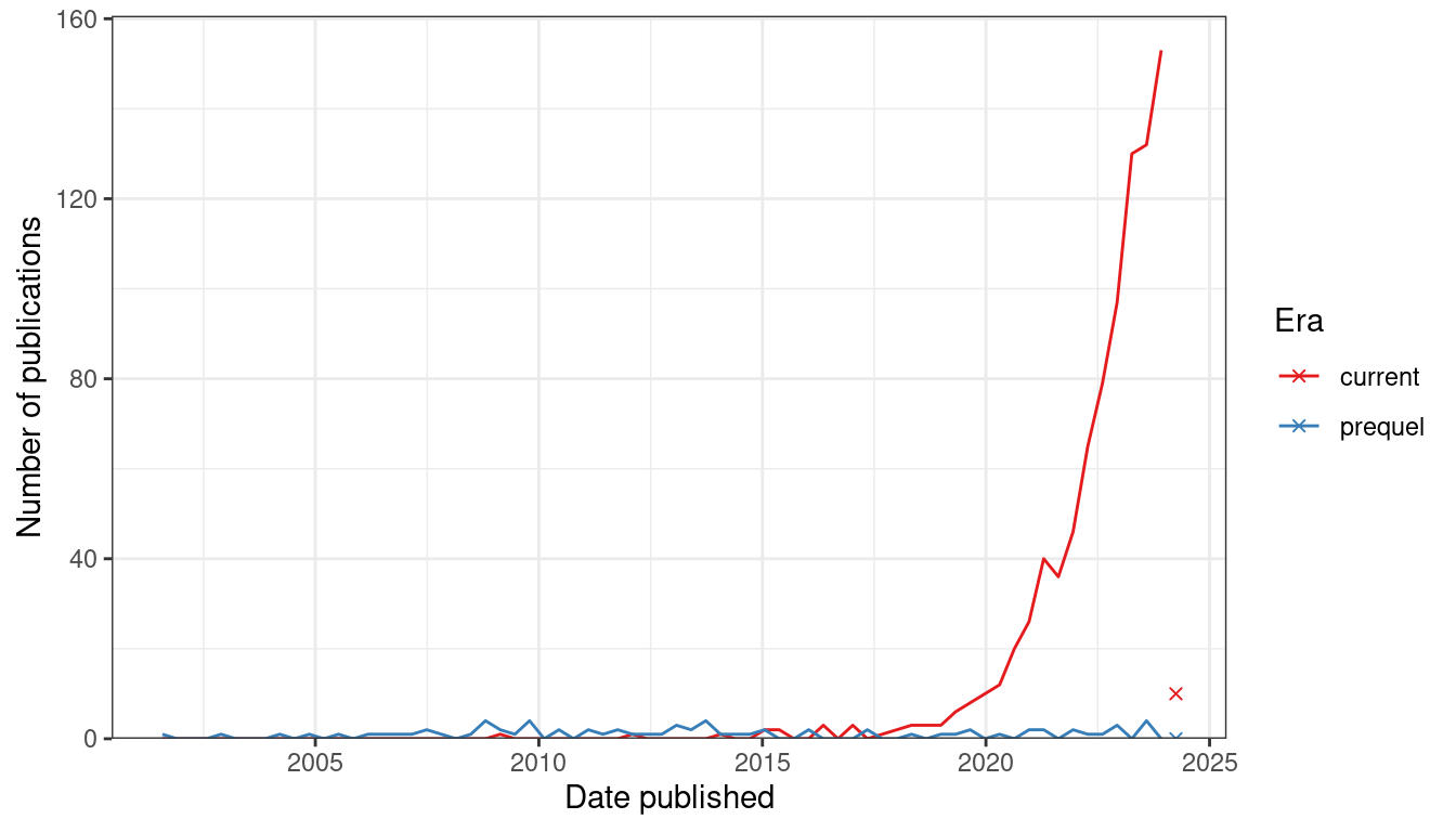
Figure 7.1: Number of publications over time for current era and prequel data analysis. Bin width is 120 days. Preprints are included for this figure. The x-shaped points show the number of publications from the last bin, which is not yet full.
Since 2019, there has been a sharp increase in interest in current era data analysis (Figure 7.2). If our collection of prequel data analysis literature is somewhat representative and complete, then interest in current era data analysis dwarfs the golden age of prequel data analysis from 2008 to 2014 (Figure 7.1). As already shown, interests in current era data collection increased sharply since 2018 (Figure 4.2, Figure 7.2), although not as sharply as in data collection (Figure 7.2).
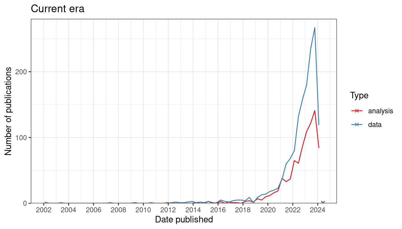
Figure 7.2: Number of publication over time for current era data collection and data analysis. Bin width is 120 days. The x-shaped points show the number of publications from the last bin, which is not yet full.
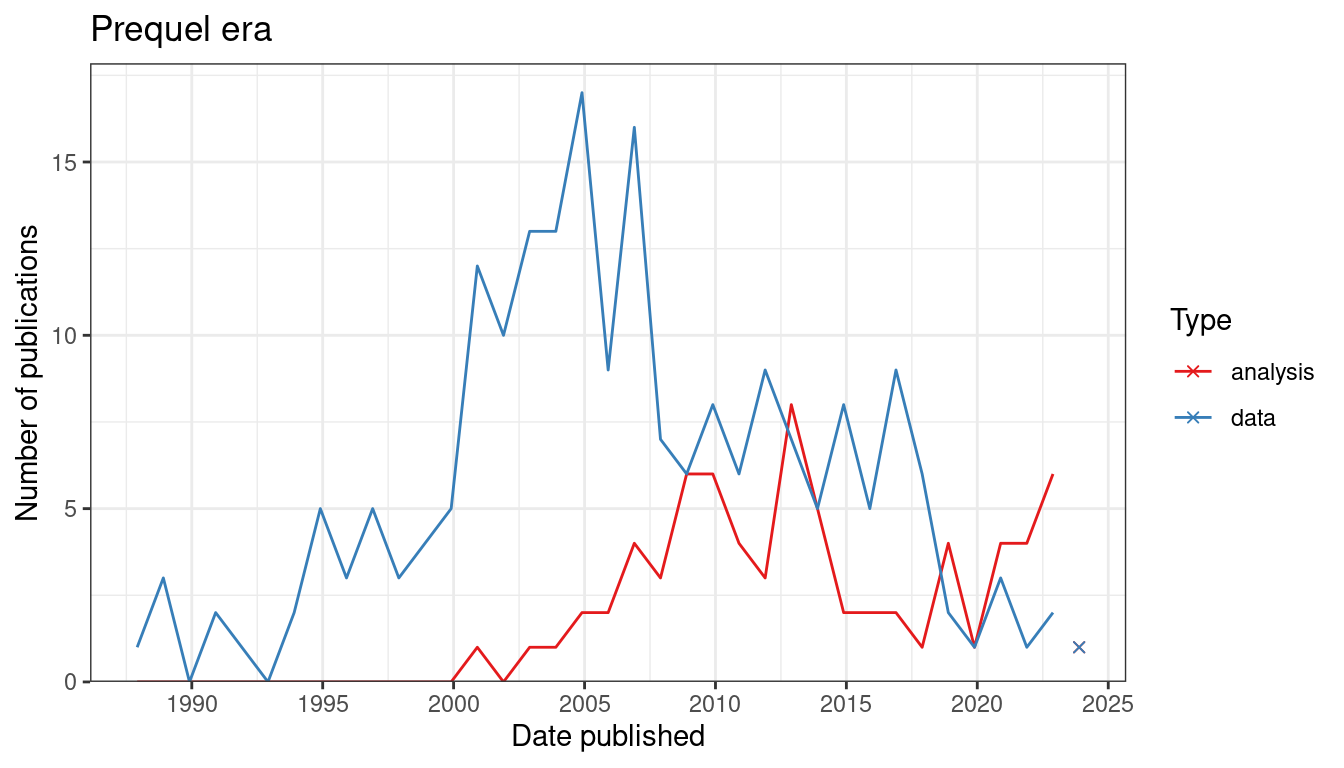
Figure 7.3: Number of publications over time for prequel data collection and data analysis. Bin width is 365 days. The x-shaped points show the number of publications from the last bin, which is not yet full.
In contrast, in the prequel era, interest in data analysis peaked after the peak for data collection, and eventually interest both eventually diminished but continues (Figure 7.3). There are many different types of data analysis, the ones with the most interest are finding spatial regions, preprocessing (including image processing and quality control), cell type inference (especially cell type deconvolution of Visium spots), and cell-cell interaction (Figure 7.4). While mapping dissociated cells to spatial locations on a spatial reference used to be at the top, there has been more interest in the other topics mentioned just now.
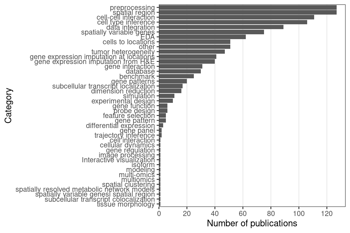
Figure 7.4: Number of publications for each category of data analysis; note that the same publication can fall into multiple categories.
Several methods for cell type deconvolution in array based techniques that don’t have single cell resolution were developed (cell type inference), but the drastic growth in data analysis seems to be driven by multiple categories of analyses (Figure 7.5). Top contributors to data analysis methods in the current and prequel eras are different as well. In the current era, while many less well-known institutions have contributed to data analysis, the top contributors are an elite club. Among the top contributors in the prequel era are less famous institutions such as Arizona State University (ASU), Old Dominion University (ODU), and Lawrence Berkeley National Laboratory (LBL), which developed the BDTNP and the Fly Enhancer atlases (Figure 7.6).
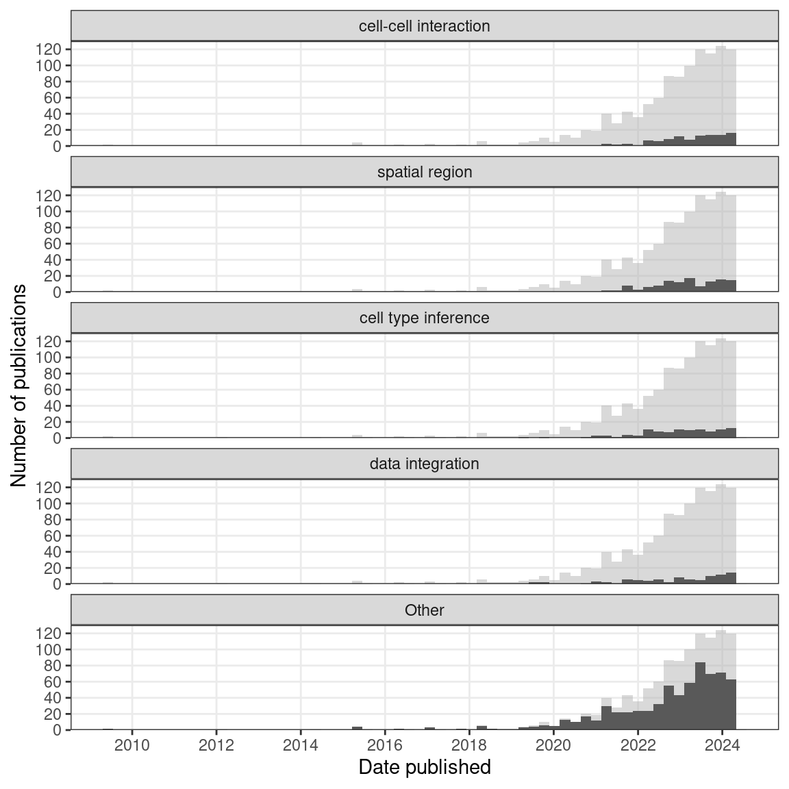
Figure 7.5: Number of publications over time broken down by type of data analysis. The 3 categories most popular in the past year are shown, and the others are lumped into ‘Other’. Bin width is 90 days.
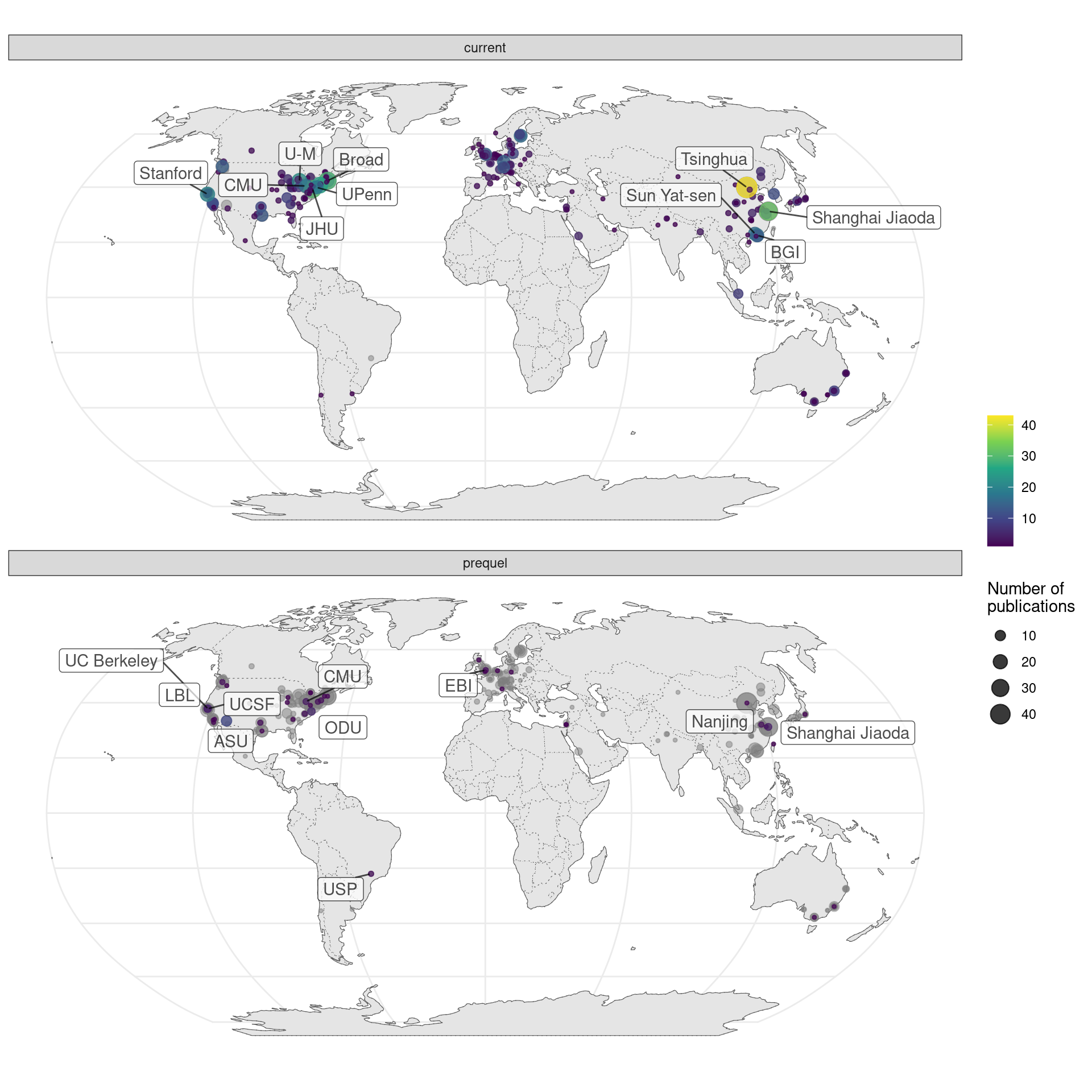
Figure 7.6: Map of where first authors of current era and prequel data analysis papers were located as of publication. Each point is a city and point size is number of publications from all institutions in the city. Top 10 institutions in each era are labeled.
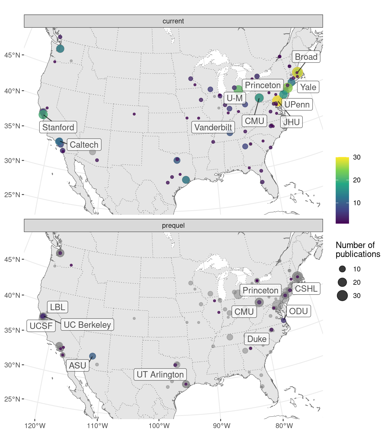
Figure 7.7: Map of where first authors of current era and prequel data analysis papers were located as of publication around continental US. Top 5 institutions in each era are labeled.
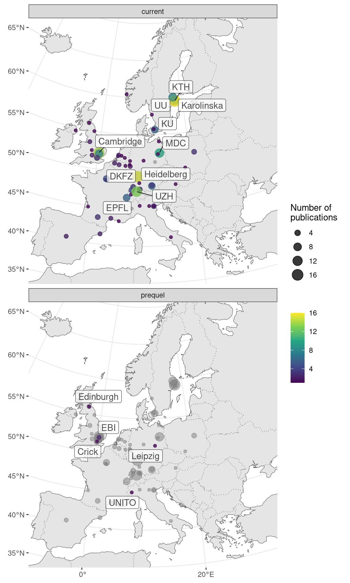
Figure 7.8: Map of where first authors of current era and prequel data analysis papers were located as of publication in western Europe. Top 5 institutions in each era are labeled.
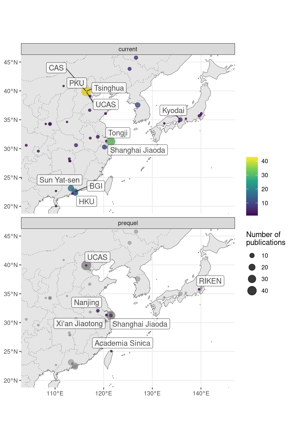
Figure 7.9: Map of where first authors of current era and prequel data analysis papers were located as of publication in northeastern Asia. Top 10 institutions in each era are labeled.
In our database, we have recorded programming languages used in data analysis or package development. All programming languages that played a major role in the project were recorded. For downstream analysis, this includes languages of the user interface of existing packages used and languages of new functions written for the project. For package development, this includes any language used to write the package essential to the functioning of the package. In publications that focus on data collection, R is by far the most popular programming language used in downstream data analysis (Figure 7.10). The second most popular is Python, and then MATLAB, which is more common in smFISH (Figure 5.28) and ISS for its image processing functionality. Python is used for both image processing and other types of analyses. C and C++ are not as common in downstream analysis.
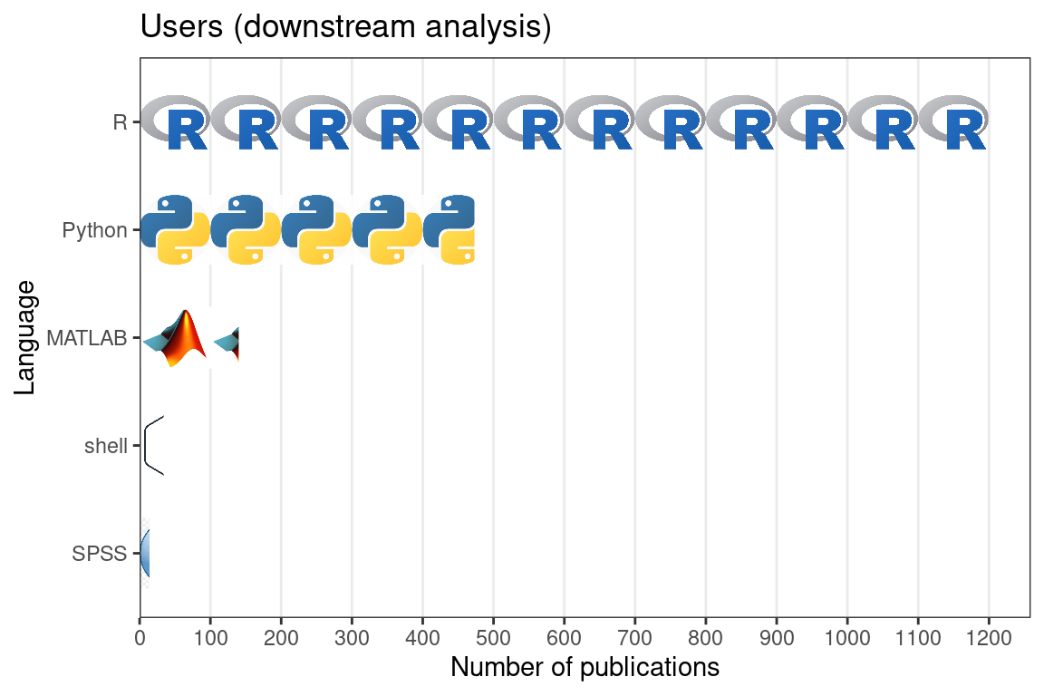
Figure 7.10: Number of publications for data collection using each of the 5 most popular programming languages for downstream data analysis.
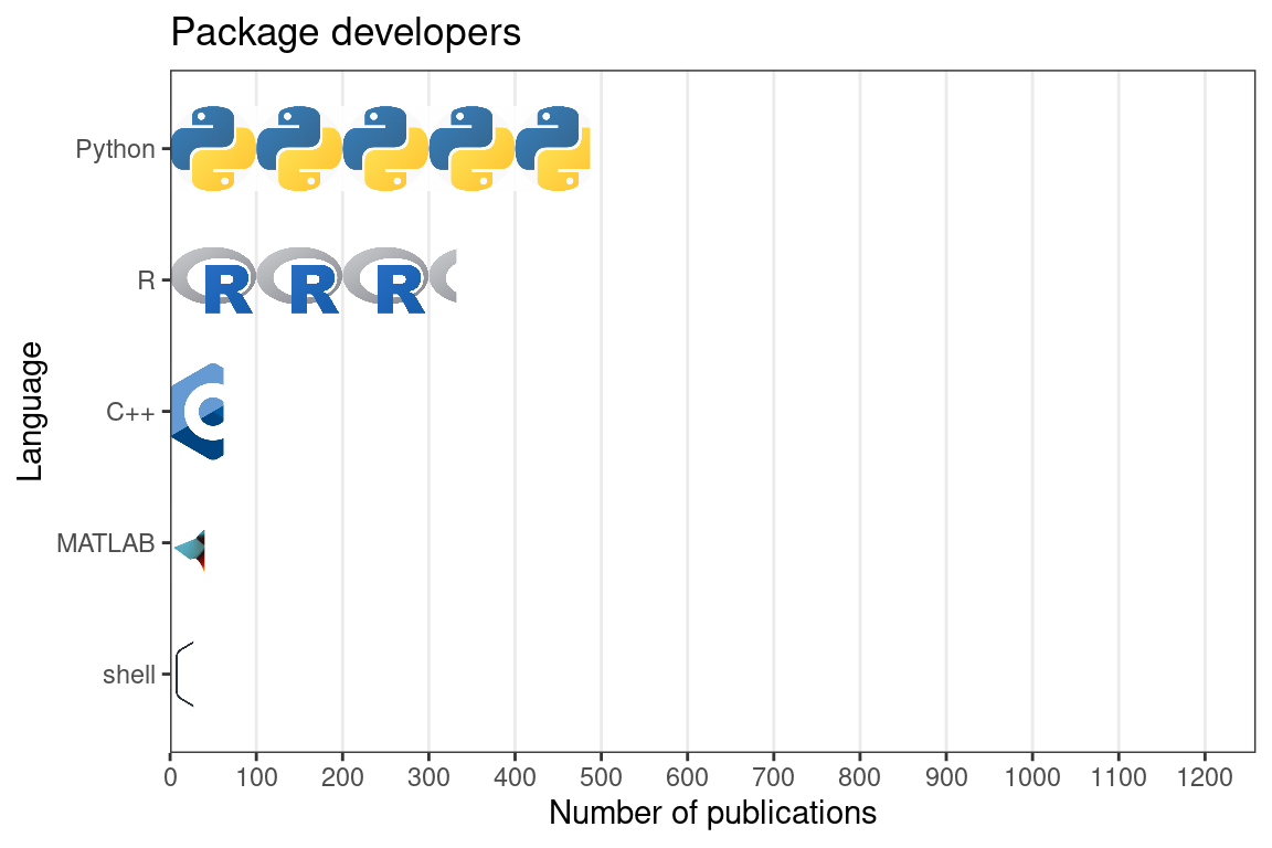
Figure 7.11: Number of publication for data analysis using each of the 5 most popular programming languages for package development. In this and the previous figure, each icon stands for 100 publications, and the x axes of both figures are aligned. Note that multiple programming languages can be used in one publication.
The same top 5 programming languages are the most common for developing data analysis packages (Figure 7.11). Python is the most popular, especially for packages involving deep learning, image processing, using Torch for optimization, or are command line tools. R follows, and is more popular for exploratory data analysis (EDA) and data visualization, but sometimes both R and Python are used in the same package. Other languages aren’t nearly as commonly used for packages reported on in our database. The above observations about usage of R and Python seem to reflect the broader cultural differences between the R and Python communities; the former caters more to the users and statisticians who do not specialize in computer science, while the latter caters more to developers and computer science specialists. MATLAB is not as commonly used for package development. While popularity of Python and R have grown (and some others such as Julia), the popularity of MATLAB seems more level (Figure 7.12). C and C++ are more common in package development than in downstream analysis, but are often used in conjunction with either R or Python or both as C and C++ are used for performance while R and Python are for user interface. With packages such as reticulate, rpy2, basilisk, Rcpp, and Cython, the most popular open source languages can be made interoperable to each other to some extent, making use of the best resources from each language.
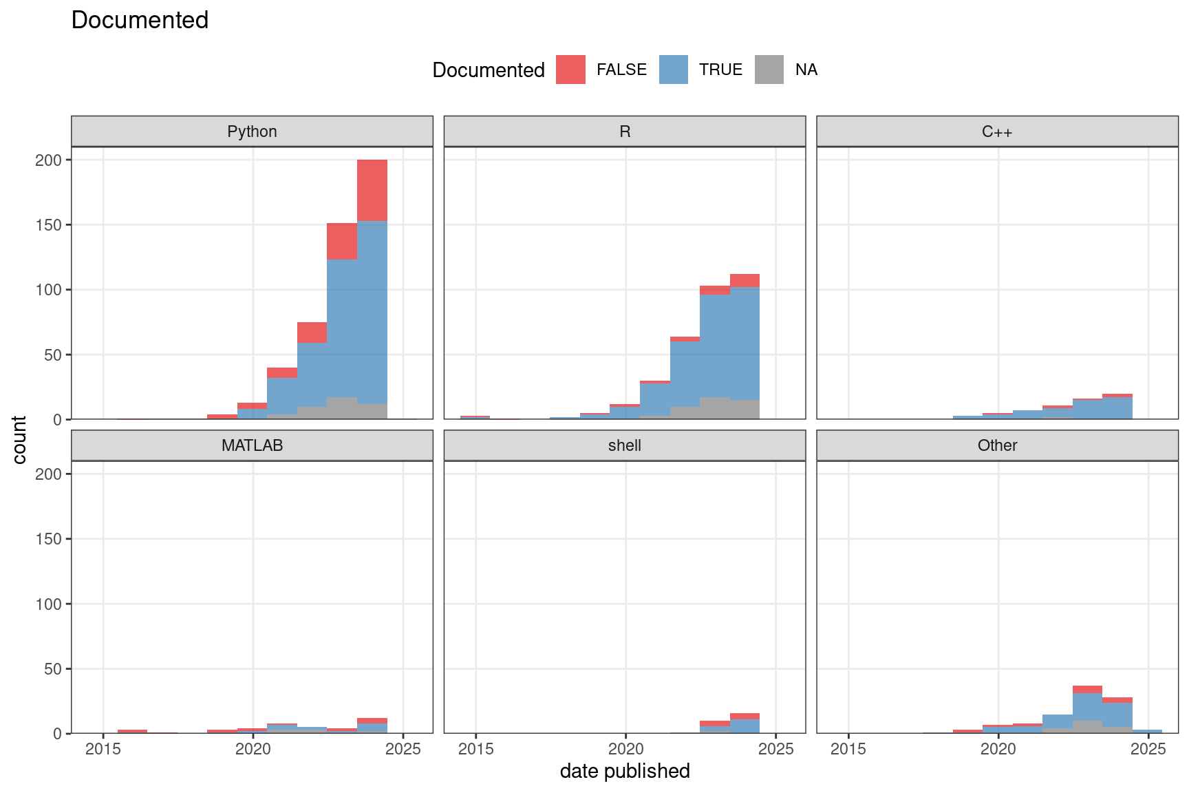
Figure 7.12: Among data analysis publications, the number of packages that are or are not well documented over time.
We have also recorded whether the package is well documented and whether it’s hosted on a public repository as a loose proxy of user friendliness and quality. Here “well documented” means at least all arguments of all functions exposed to the user are documented, though we consider it better when examples are included. Public repositories can to some extent indicate user friendliness and quality because the packages need to pass some sort of checking in order to be hosted on the repositories, though some repositories, such as Bioconductor, have stricter standards than others. Moreover, installation of the package is easier when the package is on a public repository. A majority of Python packages and the vast majority of R and C++ packages are well documented, while many older MATLAB packages are not though more recent MATLAB packages are also mostly documented (Figure 7.12). Most packages are not on a public repository such as CRAN, Bioconductor, pip, and conda (Figure 7.13). For CRAN and especially Bioconductor, this might be due to the work required to meet standards of these repositories such as to pass automated checks, write documentation, examples, unit tests (Bioconductor), and vignettes (Bioconductor).
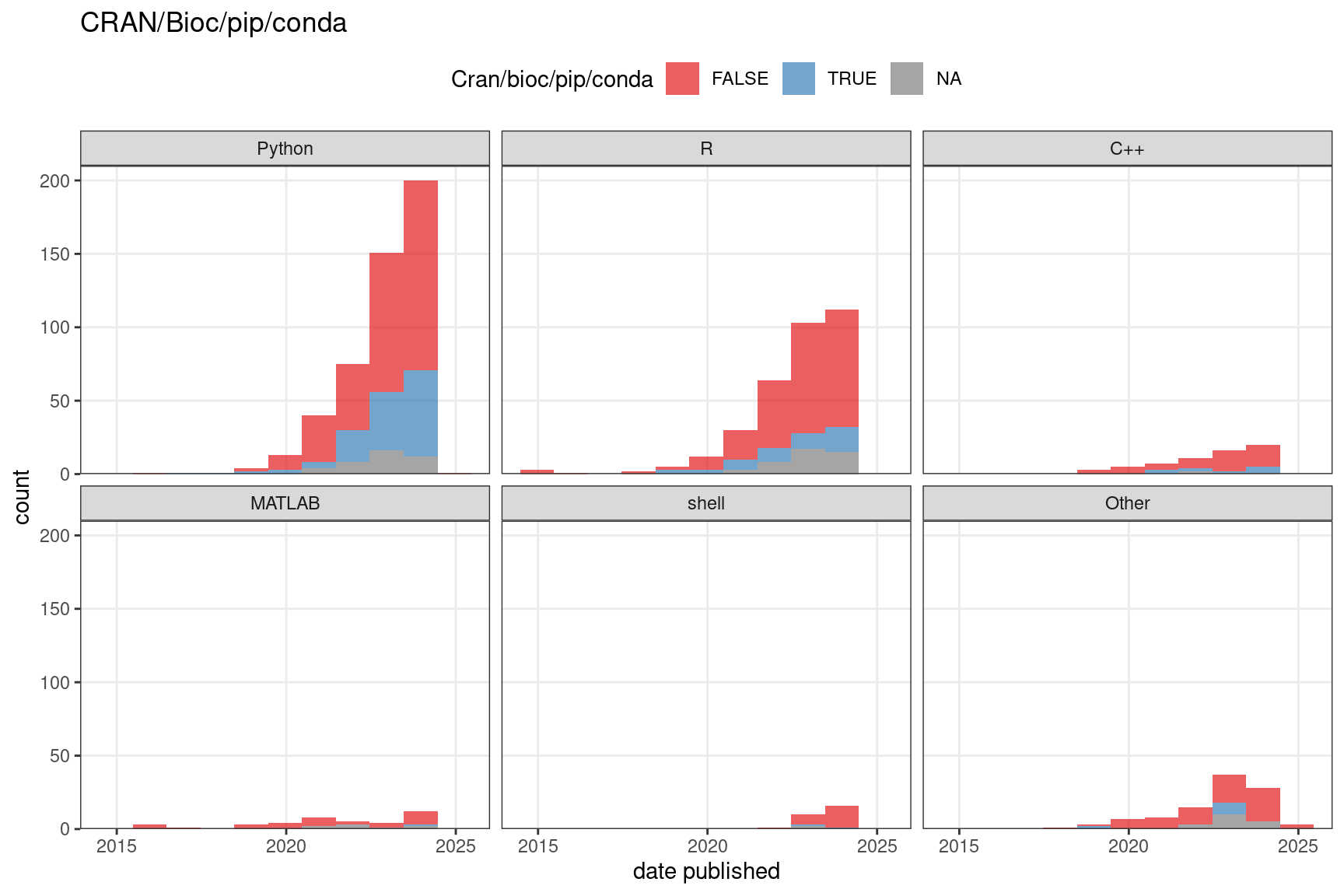
Figure 7.13: The number of packages that are or are not on a public repository such as CRAN, Bioconductor, pip, or conda over time. In both C and D, the bin width is 365 days. NA means the source code repository is not available.
Some of the most popular categories of analyses (Figure 7.4) are reviewed in the rest of this section, arranged roughly in the order each task is performed in a data analysis workflow, from converting raw data to something more amenable to biological interpretations to forming biological hypotheses. The former is specific to certain types of techniques, and includes image processing (smFISH and ISS), spatial reconstruction (scRNA-seq and smFISH and ISS data that are not transcriptome wide), and cell type deconvolution (NGS barcoding data that are not single cell resolution). The latter can largely be applied across types of techniques if given a gene by cell or spot matrix and cell or spot locations. Exceptions to the “largely” include analyses of subcellular transcript location which can only be applied to single molecule resolution data and spatial point process based methods which are more appropriate to model the cell or transcript locations rather than the fixed Visium spot locations. Each category will first be defined, and the common core principles will be summarized.
7.1 Preprocessing
By “preprocessing” we mean extracting information from raw data so common analysis methods can be applied. “Raw data” can mean any form of data, even if processed in some ways, that still needs to have information extracted for common analysis tasks to apply, such as PCA, clustering, and DE. Preprocessing for array based techniques that use NGS is similar to preprocessing for scRNA-seq. The same aligners can be used to align reads to the genome or pseudoalign to the transcriptome, and the spot barcodes can be demultiplexed just like in scRNA-seq; indeed, ST and Visium, the preprocessing pipelines ST Pipeline and Space Ranger wrap the STAR aligner. In addition, the transcript spots need to be aligned to the H&E image for visualization, interpretation, and using information from H&E for analyses. As microdissection based techniques also use NGS, preprocessing would not be very different from that of scRNA-seq or bulk RNA-seq data. However preprocessing of smFISH and ISS data is very different from that of NGS based data, and this would be the focus of this section.
The rawest data the user sees is images. As mentioned earlier, preprocessing of images was typically performed with poorly documented MATLAB code difficult to decipher by users. While some switched to Python recently, such as in MERlin for MERFISH, the preprocessing tool is still often specific to the technique of interest. The HybISS group has switched from MATLAB to Python and used starfish for spot detection and decoding, and pciSeq from this group has been reimplemented in Python (originally MATLAB) as well (Gyllborg et al. 2020; Qian et al. 2020). Some groups used GUI based tools such as Fiji, ImageJ, and CellProfiler (Shah et al. 2018; W.-T. Chen et al. 2020; Sountoulidis et al. 2020). However, as the GUI based analyses are not recorded and shared or are manual, it is difficult to reproduce such analyses.
To provide a free, open source, and well-documented preprocessing tool applicable to data from multiple techniques, the Chan Zuckerberg Initiative developed the Python package starfish implementing image registration, spot calling, barcode calling, cell segmentation, and etc. with classical image processing methods such as thresholding, image registration by translation, top hat filtering, Laplacian of Gaussian, watershed segmentation, and etc. While a good start, it’s not clear how to apply starfish to multiple FOVs based on its tutorials. To improve starfish, another Python pipeline, SMART-Q was developed, with more modularity and improvements upon starfish such as additional parameter to mitigate over-segmentation (individual cell or nucleus broken into too many pieces) by watershed and integration with immunofluorescence images of marker genes (X. Yang et al. 2020). However, SMART-Q was only demonstrated in RNAscope data without combinatorial barcoding, with one FOV at a time. Another such smFISH pipeline based on classical image processing is dotdotdot, which is written in MATLAB but the functions are well documented (Maynard et al. 2020). Again, dotdotdot was only demonstrated on RNAscope without combinatorial barcoding. There are other open source tools for one or more of the preprocessing steps, but are not meant to be a comprehensive pipeline. Below we review each step in preprocessing of smFISH and ISS raw data, how this was done in the original papers of datasets with classical image processing, and alternative and improved approaches such as ones based on deep learning or Bayesian statistics.
The packages mentioned in this section are summarized in the Table 7.1. The package names link to the code repo if available, and the titles link to the paper associated with the package. Each section in this chapter has a table like this. There are relevant packages not mentioned in this book; they can be found in the database.
7.1.1 Image registration
First, images of each FOV from different rounds of hybridization must be aligned; this is image registration. The images can be aligned to a reference of fiducial beads or DAPI staining, which is especially useful when “no fluorescence” is part of the barcode (K. H. Chen et al. 2015; Chee Huat Linus Eng et al. 2019). If “no fluorescence” is not involved, then the reference can be a particular round of hybridization (Shah et al. 2016; X. Wang et al. 2018). Image registration is usually affine, i.e. images are translated, scaled, or rotated to match the reference, and often only translation is used. However, non-linear registration has been used in case the sample does not lie flat and chromatic aberration shifts spots in different channels (Qian et al. 2020).
7.1.2 Spot and barcode calling
Then the spots representing individual transcripts are identified (spot calling). The background of autofluorescence and non-specific hybridization is often removed by thresholding or top hat filtering, only preserving brighter pixels. Spots can be identified with multi-Gaussian fitting with fixed width, which can distinguish between partially overlapping spots (K. H. Chen et al. 2015), or tightened by Lucy-Richardson deconvolution (Jeffrey R. Moffitt et al. 2018), or by identifying local maxima in intensity after identifying potential spots with Laplacian of Gaussian (Shah et al. 2016; X. Wang et al. 2018). The spots can also be identified with deep learning. In Python package graph-ISS (Partel et al. 2019), a convolutional neural network (CNN) is pretrained on manually annotated candidate signal spots from another dataset, and probability that a new candidate obtained after top hat filtering and h-maxima transform is a signal is returned by the last softmax layer of the CNN. Another CNN based spot calling tool is deepBlink (Eichenberger et al. 2020), which builds on the popular U-net architecture.
Once spots are called in each round of hybridization, spots that most likely to correspond to the same transcript are read as barcode and decoded to identify the gene encoded by the barcode (barcode calling). As image registration is imperfect, the spot coming from the same transcript may still be slightly shifted between rounds of hybridization. To identify the barcode from the rounds of hybridization, the spot in one round of hybridization is typically identified with a spot in another round if the spatial distance between the two is sufficiently small, such as less than between 1 and 3 pixels, or smaller than the distance to a barcode that contains error (Shah et al. 2016; X. Wang et al. 2018; Jeffrey R. Moffitt et al. 2016; Chee Huat Linus Eng et al. 2019).
In graph-ISS (Partel et al. 2019), spots identified from CNN from different rounds of hybridization are connected in a graph, with each spot in each round of hybridization a node and the edge weight decreases with increasing distance between spots across rounds up to a maximum distance. Edges connecting spots not from consecutive rounds are removed. The barcode is called by maximum flow of minimum costs between the sink and the source of the graph. Then a quality score is calculated for the barcode according to the CNN probability of spots and distance between spots from different rounds. Although graph-ISS was originally designed for ISS data, it might be adapted to seqFISH, HybISS, STARmap, and SCRINSHOT as well. However, for MERFISH and seqFISH+, in which a transcript may not have signal in some rounds of hybridization, graph-ISS would need to be altered. Alteration would also be required to decode STARmap’s 2 base encoding.
For MERFISH specifically, transcript counts have been statistically modeled in the Rust package MERFISHtools, which takes errors in barcode calling into account (Köster, Brown, and Liu 2019). While MERFISH’s inbuilt error correction (HD4) accounts for 1 to 0 error, which is more common, 0 to 1 errors can still occur, and there are still barcodes with so many errors that they can’t be matched to genes (dropout). The errors are modeled as a multinomial distribution with event probabilities as probabilities of identifying transcripts of a gene correctly with and without the inbuilt correction, misidentifying transcripts of a gene as those from each other gene with and without the inbuilt correction, and dropouts, with actual transcript counts, number of correct and incorrect identifications, and dropouts as latent variables to be estimated by Bayesian inference. The flat prior is used for now.
Computational methods to overcome optical crowding and to deconvolute spots were summarized in Section 5.2.3: corrFISH, BarDensr, and ISTDECO. The above mentioned spot calling methods all treat spot detection and decoding as separate tasks. In contrast, in both BarDensr and ISTDECO, the two related tasks are performed jointly.
7.1.3 Cell segmentation
To assign transcript spots to cells, the cells need to be segmented and spots within the segmented boundary of a cell must be assigned to that cell. For neurons, Nissl staining, which stains the cell body and dendrites but not axons, has been used for cell segmentation (Shah et al. 2016; X. Wang et al. 2018). Without Nissl staining, total poly-A staining can be used instead, and segmented with watershed transform, although poly-a staining concentrates in the cell body and misses cellular processes such as dendrites (Jeffrey R. Moffitt et al. 2018). This misses some interesting biological information; dendrites can have different transcriptomes from the cell body of the same neuron, both in vitro and in vivo (Middleton, Eberwine, and Kim 2019; Mattioli et al. 2019; Farris et al. 2019). Cell segmentation can be done manually as automated methods may not be sufficiently reliable and would still require manual inspection and correction, or automated with machine learning models trained by manual segmentation of smaller number of cells such as the random forest model in Ilastik (X. Wang et al. 2018; Lohoff et al. 2021) and CNN models such as DeepCell (Valen et al. 2016) and CellPose (Stringer et al. 2020). Watershed segmentation is more commonly used.
Without seeing the actual extent of the cell, the quality of manual segmentation is questionable, especially in regions with high cell density, thus limiting the performance of machine learning models. Sometimes problematic methods were used to segment cells, such as 3D Voroni tessellation (Shah et al. 2016) and convex hull of Nissl staining based segmentation (X. Wang et al. 2018); these are problematic because cells need not to take a convex shape so such segmentation may mis-assign transcripts from other cells, or to be conservative about mis-assigning transcripts from other cells, miss transcripts that in fact belong to the cell of interest. However, one study did specifically stain for membrane bound proteins for the actual extent of the plasma membrane and accurate cell segmentation (Lohoff et al. 2021).
To address the challenges of cell segmentation, segmentation methods utilizing scRNA-seq data with annotated cell types have been developed recently. One such method is Python package JSTA (Littman et al. 2020), in which a deep neural network (DNN) learns a segmentation and cell type annotation using the information from a scRNA-seq reference with cell type annotations. First, watershed is used for an initial cell segmentation, both MERFISH and scRNA-seq data are scaled and centered. Then a DNN is trained on the scRNA-seq data to predict cell type from gene expression. Then a separate DNN is trained to refine the cell boundaries iteratively with expectation maximization (EM): The cell type classifier is applied on the watershed segmented MERFISH data to classify putative cells (E). Then a random subset of the pixels are used to train the pixel classifier, maximizing a loss function comparing the new pixel cell type probabilities to the initial/previous assignment (M). The new cell type probabilities are then scaled per pixel according to distance to nuclei. Only probabilities of cell types of neighboring cells are kept and the other cell types are assigned probability 0. The new cell type probabilities of each pixel is then used as event probabilities of a multinomial distribution and randomly assign a new cell type label to the pixel. Then the new cell type assignment to pixels is used to train the pixel classifier again, until the cell type assignments converge. This may refine boundaries between neighboring cells of different types, and the initial watershed boundaries are kept for neighboring cells of the same type. A problem with this package is that inhomogeneous transcript localization is not taken into account.
7.1.4 Alternatives to cell segmentation
Due to the challenges in accurate cell segmentation, some analysis methods did away with cell segmentation altogether, directly using the transcript locations. In the Julia package Baysor (Petukhov et al. 2020), based on Markov random field (MRF), which encourages nearby transcripts to take the same label. A spatial neighborhood graph is constructed with Delaunay triangulation with each transcript as a node. The probability of each transcript taking each label is modeled with a MRF and initial edge weights decrease with distance. This package first distinguishes between intracellular transcripts and extracellular background. Then it can also assign transcripts to cell types without cell segmentation, with a scRNA-seq reference with cell type annotations; as locations of the transcripts are known, this amounts to annotating tissue regions with cell types. It can also segment cells, with existing segmentation and staining (e.g. Nissl, DAPI, and poly-A) as priors. Cell segmentation can also be informed by cell type labels, so transcripts from different cell types are not assigned to the same cells. Each of the three functionalities, identifying intracellular transcripts, cell type annotation of transcripts, and cell segmentation, is based on a different MRF model. The parameters of the model, such as edge weights, labels of other transcripts, and etc. are estimated with EM. The drawbacks of this package are that its current implementation is limited to 2D and it does not take inhomogeneous subcellular transcript localization into account.
Besides cell type annotation of transcripts based on MRF, another segmentation-free method is also described in the Baysor paper (Petukhov et al. 2020), in which the \(k\) nearest neighbors of each transcript are taken to be a pseudo-cell and analyzed by standard scRNA-seq data analysis methods such as clustering, PCA, and UMAP. For ISS, transcripts can be probabilistically assigned to cells and cells to cell types, with pciSeq (Qian et al. 2020). Briefly, spatial locations of transcripts are modeled by a Poisson point process whose intensity is scaled by a term following Gamma distribution to give the negative binomial distribution of transcript counts in cells. The intensity for each gene and each cell is also informed by distance between transcripts and nucleus centroids (from DAPI), scRNA-seq data of the cell type this cell belongs to, and the detection efficiency of ISS. The data consists of locations of transcripts and the genes they come from. The unknown parameters, such as probability of each transcript to come from each cell and each cell from each cell type, are estimated by variational Bayesian inference. Cell types and spatial domains can also be identified without scRNA-seq cell type annotations as well.
In the Python package SSAM (Jeongbin Park et al. 2019), transcript density is first estimated with Gaussian kernel density, which is then projected into a square lattice. Local maxima of transcript density are taken as pseudo-cells and clustered to infer de novo cell types. Then tissue domains are identified by clustering sliding windows of spatial cell type maps. Tissue domains can also be identified without appealing to cell types.
In the Python package spage2vec (Partel and Wählby 2020), graphs are constructed by connecting each transcript spot to its neighbors within a certain distance such that at 97% of all transcript spot are connected to at least one neighbor. Then the transcript spots with these graphs are projected by a graph neural network (GNN) into a 50 dimensional space which is informed by the graphs and thus local neighborhoods of transcripts. The transcript spots in the 50 dimensional space can then be clustered or projected to 2 or 3 dimensions with UMAP to show tissue domains.
7.2 Exploratory data analysis
After data preprocessing, as described above, for array or microdissection based data, we get a gene count matrix with locations of voxels, and for smFISH and ISS based data, we get locations of transcripts, and if cell segmentation is performed, a gene count matrix and cell boundaries as well. For scRNA-seq, Seurat (Stuart et al. 2019), scanpy, and packages surrounding SingleCellExperiment on Bioconductor such as scran and scater implement further preprocessing of the gene count matrix, such as data normalization and scaling, as well as basic EDA methods to inspect and create an overview of the data, such as quality control (QC), data visualization, finding highly variable genes, dimension reduction, and clustering, and have user friendly tutorials, consistent user interface, and decent documentation. Such integrative EDA packages, as well as more specialized data visualization packages, have emerged for spatial transcriptomics as well, and are reviewed in this section.
In practice, spatial transcriptomics data is often analyzed with standard scRNA-seq analysis at the EDA stage, with one or more of PCA, tSNE, UMAP, clustering cells or spots, and finding marker genes for clusters, and differential expression (DE) between case and control (Shah et al. 2016; Jeffrey R. Moffitt et al. 2018; M. Zhang et al. 2020; Moncada et al. 2020; Berglund et al. 2018). For ST and Visium, the data is also often normalized like in scRNA-seq with CPM or classical Seurat log normalization and scaling (Moncada et al. 2020; A. L. Ji et al. 2020; Berglund et al. 2018). Seurat also implements data integration, which has been used to transfer cell type labels from scRNA-seq to Visium for cell type deconvolution (Mantri et al. 2020), and can potentially be used to impute gene expression in non-transcriptome wide spatial data from scRNA-seq (discussed in Section 7.3). Then the clusters, marker genes, and genes of interest from scRNA-seq are often visualized within spatial context, and some studies proceed to other analyses that utilize the spatial information. Due to the relevance of scRNA-seq data normalization, EDA, and data integration to spatial data, the existing scRNA-seq ecosystems of Seurat, scanpy (spatial part in Squidpy (Palla et al. 2022)), and SingleCellExperiment (spatial part in SpatialExperiment (Righelli et al. 2022)) are adapting to the rise of spatial transcriptomics, with new data structures, visualization of gene expression and cell metadata (e.g. total UMI counts, cluster, and cell type) on the spatial coordinates, with H&E as background for ST and Visium, and perhaps other spatial functionalities such as spatial neighborhood graphs and spatially variable genes.
There are other EDA packages not originating from an existing scRNA-seq EDA ecosystem as well. R packages Giotto (Dries et al. 2021), STUtility (L. Bergenstråhle et al. 2020), and SPATA (Kueckelhaus et al. 2020) not only support basic QC and EDA functionalities like those in Seurat, but also spatial analyses not supported by Seurat. These packages are well documented, but are not (yet?) on CRAN or Bioconductor.
Giotto has two main parts: Giotto Analyzer and Giotto Viewer. Besides basic Seurat functionalities and spatial data visualization, Giotto Analyzer implements several types of spatial analyses to be reviewed in more detail in the rest of this section: cell type enrichment in spatial data without single cell resolution, identifying spatially variable genes, gene co-expression patterns, cellular neighborhoods, interactions between cell types and ligand-receptor pairs in such interactions, and genes whose expression is associated with cell type interactions. However, the methods implemented in Giotto tend to have simpler principles than those of more specialized packages for each of the above tasks, such as hypergeometric test for cell type enrichment and spatially coherent genes, though Giotto wraps specialized packages such as SpatialDE (Svensson, Teichmann, and Stegle 2018), trendsceek (Edsgärd, Johnsson, and Sandberg 2018) for spatially variable genes, and smfishhmrf (Q. Zhu et al. 2018) to identify spatial cellular neighborhoods. Giotto Viewer provides interactive visualization of the data. As Giotto uses its own object class to store data, interoperability with other single cell and spatial software becomes more challenging given the popularity of Seurat and SingleCellExperiment.
In contrast, STUtility develops upon the Seurat class, so is interoperable with other Seurat functionalities. STUtility is specific to ST and Visium, while Giotto applies to all spatial technologies with cell or spot level data. Beyond Seurat, STUtility enables masking the array to remove spots outside the tissue, alignment of multiple sections, manual annotation and alignment with shiny, visualization of the aligned sections in 3D, finding neighbors of spots of a given type, and using NMF to identify archetypal gene expression patterns. While Giotto and STUtility might not have the most sophisticated spatial analysis methods, their main advantage is akin to that of Seurat and SingleCellExperiment, namely that multiple analysis tasks, often with a variety of algorithms for each task, can be done with the same object class and user interface, saving the time and trouble on learning new syntax and converting objects to new classes.
SPAtial Transcriptomic Analysis (SPATA), while implementing its own class, uses Seurat for data normalization and dimension reduction. SPATA also implements functions to visualize spatial data and a shiny app for not only interactive data visualization but also manually setting spatial trajectories and annotation of spatial regions. It also wraps Monocle 3 (J. Cao et al. 2019) for pseudotime analysis and SPARK (S. Sun, Zhu, and Zhou 2020) for finding spatially variable genes. In addition, SPATA implements its own method of finding spatially variable genes, reviewed in Section 7.5.
Some R packages have also been written for specific visualization tasks, but not the entire EDA process. Spaniel is a package that builds on Seurat and SingleCellExperiment for interoperability and implements QC plots that help the user to remove ST or Visium spots outside the tissue. However, Spaniel’s main difference from STUtility is that Spaniel can create a shiny app for interactive visualization and exploration of the data. While this may make Spaniel sound unremarkable, it was written about a year before Seurat supported spatial data. Another specialized package is SpatialCPie (J. Bergenstråhle, Bergenstråhle, and Lundeberg 2020), which also uses shiny for interactive visualization. SpatialCPie cluster ST or Visium data at multiple resolutions and plots a graph showing how clusters from one resolution relates to those from other resolutions. It also plots a pie chart at each ST or Visium spot, on top of an H&E background, showing similarity of each spot to each cluster, to give a more nuanced view than simply coloring the spots by cluster. Both packages are on Bioconductor.
7.3 Spatial reconstruction of scRNA-seq data
It may be fair to say that the holy grail of spatial transcriptomics is to profile the whole transcriptome at single cell resolution and without dropouts. We have already seen that, with seqFISH+ and ExM-MERFISH, this goal seems to possibly be within reach. However, the goal may be further than is seemingly the case, as the smFISH based techniques are still not generally applied to more than a few dozens to a few hundreds of genes, in the order of 10,000 cells (Figure 5.23, Figure 5.24), which only covers a small area of tissue. Meanwhile, techniques without single cell resolution and with lower detection efficiency but can cover large swaths of tissue have grown in popularity (Figure 5.37). Hence spatial transcriptomics has not supplanted scRNA-seq – which has also grown tremendously in popularity in recent years (Svensson, Veiga Beltrame, and Pachter 2020) – but remains a complement. Spatial data that is not transcriptome wide can be complemented by scRNA-seq for information of other genes; this section reviews computational methods that map cells from scRNA-seq to spatial locations with a small panel of landmark genes and/or to impute gene expression not profiled by the spatial reference in space, or in short spatial reconstruction of scRNA-seq data. These are the most common types of data analysis(Figure 7.4). The two tasks are related but distinct, as when cells from scRNA-seq are mapped to spatial locations, spatial patterns of the genes expressed in the cells are also predicted. However, gene expression can also be predicted at spatial locations without mapping cells to the locations. Spatial data that does not have single cell resolution can be complemented by scRNA-seq for cell type deconvolution of the spots (Section 7.4). In turn, spatial data complements scRNA-seq with spatial information such as gene expression patterns and cell neighborhoods.
Attempts at spatial reconstruction of single cell data date back to 2014, when growth in the popularity of scRNA-seq started to pick up pace (Svensson, Veiga Beltrame, and Pachter 2020). Early (2014-2017) methods tend to fall in three categories: direct dimension reduction with PCA, ad hoc scoring, and pseudotime projected into space. The first two have been by and large abandoned due to their limitations, and the third isn’t commonly used. Another category is generative modeling, which we consider intermediate due to its early origin and lasting legacy as some later methods involve more sophisticated generative modeling. Later (2018-present) methods commonly involve a lower dimensional latent space shared by the scRNA-seq and the spatial data, and many different approaches have been tried to obtain the shared latent space and project it back into the higher dimensional space of gene expression. However, other principles were used as well, such as optimal transport, nonlinear direct dimension reduction, black box machine learning, mixture of experts model, and etc.
7.3.1 Direct dimension reduction
As already mentioned in our summary of Puzzle Imaging, spatial reconstruction of dissociated tissue can be considered a dimension reduction problem. Here with scRNA-seq, the high dimensional gene expression data is directly projected to 1 to 3 dimensions that correspond to the spatial dimensions.
One of the earliest reconstruction methods (2014) maps single cell qPCR data onto a sphere that mimics the developing mouse otocyst (R. Durruthy-Durruthy et al. 2014). Ninety six genes were profiled with qPCR in single cells, and the gene expression profiles were projected to the first 3 principal components (PCs), which are then projected onto the surface of a sphere. The sphere is oriented on the dorsal-ventral (DV), anterior-posterior (AP), and left-right (LR) axes by expression of marker genes known to be expressed in one end of those axes. At least for the otocyst, this approach seemed to recapitulate expression patterns of many genes, at least qualitatively, at the resolution of octants. This approach was later adapted to reconstruct the human (J. Durruthy-Durruthy et al. 2016) and mouse (Mori et al. 2017) blastocysts. A one dimensional version of this approach was also adapted to spatially reconstruct cells from the organ of Corti along the apical and basal axis, though the PCA was performed only on DE genes between apical and basal cells and 2 PCs were projected to 1 dimension (Waldhaus, Durruthy-Durruthy, and Heller 2015).
Direct dimension reduction is still used after 2018, with dimension reductions other than PCA. Another form of dimension reduction for spatial reconstruction is the self-organinzing map (SOM) as in the package SPRESSO (Mori et al. 2019). The Geo-seq mid-gastrula mouse embryo data (G. Peng et al. 2016) was reconstructed in 3D with genes selected from GO terms; 18 genes selected from a few GO terms could place all microdissected samples into the correct AP/LR quadrant with SOM. However, such genes were found by checking the SOM projections from thousands of GO combinations against the Geo-seq ground truth and may not apply to other biological systems. Also, the spatial reconstruction along the DV axis was not checked, though in Geo-seq, the samples were microdissected along the DV axis with a cryotome in addition to dissection into AP/LR quadrants with LCM.
A more recent, graph based dimension reduction is GLISS (Junjie Zhu and Sabatti 2020). After using a Laplacian score based method to identify landmark genes from spatial data (to be reviewed in Section 7.5), a graph is constructed for the scRNA-seq data based on similarity in expression profiles of the landmark genes among cells as a proxy to spatial locations. With this graph, a new set of genes whose expression depend on the structure of the graph, or spatially variable genes, are identified, and added to the landmark genes. A new similarity graph is then constructed with both the landmark genes and spatially variable genes, and the dimension reduction is the eigenvectors of the graph Laplacian of this graph, starting from the second eigenvector. One dimensional projection would be the second eigenvector. Two dimensional projection would be the second and third, and so on.
Ligand-receptor (L-R) pairs have also been used for direct dimension reduction, in CSOmap (Ren et al. 2020). Expression of L-R pairs in scRNA-seq cells is used to construct a cell-cell affinity matrix, with higher affinity meaning that two cells are more likely to be close to each other. Then an algorithm similar to tSNE is used to project the affinity matrix into 3 dimensions, corresponding to the physial dimensions. The Kullback–Leibler (KL) divergence between the affinity and probability of the two cells to be neighbors is minimized, with constraints of the minimum physical size of the cell and the amount of space available.
7.3.2 Ad hoc scoring
The methods above tend to only capture simple spatial patterns with simple gradients along axes, or have low resolution that is effectively restricted to octants or quadrants. More complex patterns with higher resolution can be reconstructed qualitatively with some score that measures similarity between each cell in scRNA-seq and each location in a spatial reference for the genes present in both datasets and favors genes more specific to a subset of cells. The spatial pattern of the score is the predicted gene expression pattern. As the score is qualitative and does not utilize statistical modeling of the data, this is called ad hoc scoring. The spatial reference is FISH (not smFISH) data of a panel of genes, with images for different genes registered onto a common coordinate system. As FISH is not very quantitative, both the spatial and the scRNA-seq data are binarized into “on” and “off” for each gene, and the predicted gene expression patterns based on the score is binarized as well since the score is only qualitative. Such approach is simple to implement, but the binarization misses quantitative nuances of gene expression patterns.
Ad hoc scoring has been used in Platynereis dumerilii brains; the FISH atlas was broken into voxels 3 \(\mu\)m on each side, smaller than the average single cell, and 98 landmark genes in the atlas used to predict patterns of other genes in scRNA-seq with a score (Achim et al. 2015). A different method, DistMap, uses a score based on Matthew correlation coefficient (MCC) was used to soft assign cells from scRNA-seq to locations in the BDTNP atlas with 84 landmark genes and to predict expression patterns of the other genes (Karaiskos et al. 2017). The latter method inspired the DREAM Single-cell transcriptomics challenge in 2018 (Tanevski et al. 2020), a competition in which participants select the most informative genes and predict cell locations with 60, 40, and 20 of the 84 BDTNP landmark genes. At least some participating teams adapted the scoring method used in the original DistMap after selecting genes with their own methods (Alonso, Carrea, and Diambra 2020; Pham et al. 2020).
7.3.3 Generative models
Many areas in spatial transcriptomics data analysis describe the data with a plausible statistical model and fit such a model to the data. Generative models have several advantages. First, uncertainties in parameter estimates and model predictions can be computed. Second, the model is more explainable, i.e. that humans may understand contributions of variables to the fitted model. Explainability plays an important role in models identifying spatially variable genes. As already mentioned, some of the segmentation-free smFISH or ISS analysis packages, such as pciSeq, rely on generative models. Generative models are used for spatial reconstruction of scRNA-seq data as well.
The popular scRNA-seq EDA package Seurat originated from spatial reconstruction of scRNA-seq data in 2015, to map cells from scRNA-seq to a WMISH reference with 47 landmark genes (Satija et al. 2015). The WMISH images were mostly obtained from ZFIN, and divided into 128 bins, which was then collapsed into 64 due to LR symmetry. As WMISH is not very quantitative, the WMISH reference was binarized. Due to the sparsity of scRNA-seq data, the normalized scRNA-seq data was smoothed. Then a mixture of 2 Gaussian distributions was fitted to each gene, for the “on” and the “off” states. With such distributions, the posterior probability that each cell comes from each bin can be calculated with the probability that the cell is “on” of “off” like in the bin for the 47 genes, although cells can very well have intermediate and more nuanced gene expression. The spatial centroid of each cell is the center of mass of the spatial map of the posterior probabilities. So far, the landmark genes have been assumed to be independent, which is unrealistic. Centroids that are close to actual bins are then used to calculate a covariance matrix of a subset of the landmark genes for each bin, with which the Gaussian mixture models and posterior probabilities are updated. While this model seems reasonable, it is no longer used, likely because of the advances in highly multiplexed smFISH and ISS that produced quantitative spatial references that do no need binarization for some tissues, especially the mouse brain. Nevertheless, the scRNA-seq part of Seurat lived on. As already mentioned, WMISH or ISH atlases are the only spatial transcriptomics resources available for some biological systems and most of the atlases are not transcriptome wide, so this method can still be useful.
A different generative model was used to map scRNA-seq cells to a smFISH atlas in the mouse liver (Halpern et al. 2017). Six marker genes known to be patterned in the portal-central axis of the hepatic lobule were profiled with smFISH. Then the smFISH data was binned into 9 zone, normalized, and each gene in each zone was modeled with a gamma distribution, which was then multiplied by coefficients correcting for the fact that only part of the cell is in the tissue section for the \(\lambda\) of a Poisson distribution to form a negative binomial distribution. The negative binomial distribution was sampled and normalized for the whole cells in scRNA-seq and proportion of UMIs from the gene of interest, which would approximate the distribution of a cell in each zone having expression levels of the gene of interest. The prior probability of a hepatocyte originating from each zone seems to be the relative area of the concentric ring that is each zone, centered on the central vein. With the prior and the sampled distribution of expression of marker genes, the posterior probability of each cell from each zone can be calculated with Bayes rule. To impute expression of genes other than the 6 markers in each zone, the gene count matrix is multiplied to the posterior probability matrix (after weighing the probabilities). Here the 6 markers are assumed to be independent, which might not be realistic. The same approach is still used by the same lab for more recent liver datasets (Halpern et al. 2018; Droin et al. 2020), although we are unaware of its use outside that lab.
Some of the shared latent space methods are based on generative models as well, with the latent space as part of the model. In gimVI (Lopez et al. 2019), which is adapted from scVI specifically to impute gene expression in space by integrating spatial and scRNA-seq data, gene expression in scRNA-seq is modeled with the negative binomial (NB) or zero inflated negative binomial (ZINB) distribution, and the spatial data is modeled with the Poisson or NB distribution (depending on the technology and dataset). The scRNA-seq and spatial data are modeled as coming from a shared latent lower dimensional space, which is decoded back to the higher dimensional gene expression space by a neural network to capture nonlinear structures as part of the mean parameters of the NB, ZINB, or Poisson distributions. The latent space is estimated when the model is fitted with variational Bayesian inference. To impute gene expression in space, the latent space is sampled and passed through the decoding neural network to get the mean parameters of the gene expression distributions for spatial data.
Another generative model with a shared latent space is semi-supervised t-distributed Gaussian process latent variable model (sstGPLVM) (Verma and Engelhardt 2020). The scRNA-seq or spatial data is modeled as coming from a noisy sample in high dimension from a lower dimensional shared latent space. The latent space can be concatenated to fixed covariates such as batch, technology used to collect data, spatial coordinates, and etc. and is estimated with black box variational inference. Missing data in gene expression and covariates can be estimated from the latent space, thus enabling mapping scRNA-seq cells to spatial coordinates and imputing gene expression, and the latent space can be collapsed across a covariate to remove its effect. The latent space has a Gaussian prior with identity variance. The prior of the high dimensional noiseless space is a Gaussian process with covariance between cells defined by a kernel that is a weighted sum of Matern 1/2 and Gaussian kernels to allow for a non-smooth manifold that better represents data. The input to the kernel is a weighted sum (length scales of kernel) of l1 distance between the cells in the latent space (including the covariates). The noise added to the noiseless high dimensional space to model actual data is a heavy tailed Student’s t distribution, to account for overdispersion and non-Gaussian distribution of the data. This method is not specifically designed for spatial data, but can be used to integrate different scRNA-seq datasets as well.
7.3.4 Shared latent space
There are some additional methods that project scRNA-seq and spatial data into a shared latent space to impute gene expression in space but without generative modeling. Some of them are designed for data integration in general, but included here the authors demonstrated integration of scRNA-seq and spatial data, seeming to intend their packages for such usage.
In version 3 or later of Seurat (Stuart et al. 2019), the scRNA-seq and spatial datasets are projected into a shared latent space by canonical correlation analysis (CCA), which finds a low dimensional space that maximizes correlation between the two dataset, or by projecting one dataset into a low dimensional PCA space of the other dataset. Then anchor cells are identified, as cells in the two datasets with sufficient shared neighborhood, and the weight of each anchor on each cell in the spatial dataset is calculated by ad hoc scoring favoring closeness in the latent space and more similar shared neighborhood to the anchor. Gene expression is then simply transferred from scRNA-seq to spatial data by multiplying the normalized gene count matrix of genes absent from the spatial data in scRNA-seq with the anchor weight matrix.
LIGER (Welch et al. 2019) is a different data integration method, of which a Seurat wrapper has been implemented. The latent space is inferred by integrative NMF, which finds a set of factors unique to the scRNA-seq or the spatial dataset, and a set of factors shared by both. Gene expression is imputed in spatial data by averaging the expression of genes of interest in the \(k\) (50) nearest neighbors (kNN) from the scRNA-seq data in the space spanned by the shared factors.
In SpaGE (Abdelaal et al. 2020), a common latent space is inferred as such: gene shared by the spatial dataset and scRNA-seq are used to do PCA independently for the two datasets. Then the cosine similarity matrix of the PCs of the two dataset is passed to singular value decomposition (SVD). Then the left and and right singular vectors are used to align the PCs to a common latent space of principal vectors. The original data is projected into the space spanned by the principal vectors of the scRNA-seq data. Then kNN is used to project gene expression from scRNA-seq to spatial data.
In Harmony (Korsunsky et al. 2019), the data, with different batches, is first PCA projected. Then the PCA projection is clustered with an altered k-means clustering algorithm that assigns cells probabilistically to clusters and maximizes diversity in batches in each cluster. Then the batch correction is found by mixture of expert model. In each cluster, the PCA projection is modeled by a linear combination of variables in the design matrix (containing batch information), with an intercept term for batch free variation in each cluster. The batch correction term is a weighted sum of the linear model predictions excluding the intercept term, weighted by the probabilistic assignment of each cell to each cluster. Then the batch correction term is subtracted from the original PCA projection. The clustering and correction are repeated until convergence. This way, the cells from scRNA-seq and spatial data are aligned in a common latent space. Then gene expression is imputed in spatial data with kNN.
7.3.5 Other principles
Approaches that do not fall into the categories reviewed above are reviewed in this subsection, including projecting pseudotime into space, black box machine learning, and optimal transport.
In some biological systems, cell differentiation corresponds to physical locations of the cells, so pseudotime, which supposedly arranges cells along differentiation trajectories, have been mapped to space, thus placing dissociated cells in space. For instance, in the bone growth place, cells at different stages of differentiation are physically arranged along the length of the bone in a cylinder, so the pseudotime trajectory of the cells was simply warped into a straight line for spatial reconstruction (J. Li et al. 2016). Similarly, in Drosophila larva, cell differentiation corresponds to the proximal-distal axis in the antenna disk and the AP axis in the eye disk, so cells from both scRNA-seq and scATAC-seq were binned according to pseudotime and assigned to the corresponding bins in the eye-antenna disk (González-Blas et al. 2020). However, this would not work in tissues without such neat correspondence, such as the Drosophila embryo, in which some genes are expressed in periodic patterns to specify segments.
Deep learning libraries such as PyTorch also made it more effective to predict locations for scRNA-seq cells without a pre-conceived statistical model of the data. For instance, after data normalization and batch correction, a deep neural network can be trained on ST data with annotations of spatial regions to predict spatial regions for scRNA-seq data (Ortiz et al. 2020). In addition, PyTorch’s gradient-based optimization has been used to probabilistically map scRNA-seq cells to spatial locations in Tangram (Biancalani et al. 2020). The spatial reference is voxelated, and a mapping matrix of probability of each cell mapping to each voxel is inferred by minimizing KL divergence between mapped and actual cell density in each voxel and favoring stronger correlation between mapped data and the spatial reference in expression of each gene across voxels and gene expression profiles of each voxel.
Thus far, the reconstruction methods do not take spatial autocorrelation – i.e. that cells physically closer to each other are more likely to have more similar gene expression profiles – in the spatial data into account. Optimal transport, i.e. finding a way to transport a pile of dirt from one place to others with minimum cost, has been used to exploit spatial autocorrelation to map scRNA-seq cells to spatial locations. In novosparc (Nitzan et al. 2019), neighborhood graphs are constructed for scRNA-seq in gene expression space and for spatial reference data in physical space. Then assuming spatial autocorrelation, optimal transport is used to place cells in locations to make the two graphs match. This can be done without gene expression data in the spatial grid, but can be improved with a spatial gene expression reference. In SpaOTsc (Cang and Nie 2020), first an optimal transport plan from scRNA-seq cells to spatial locations is inferred with gene expression dissimilarity matrices between scRNA-seq cells and between cells and locations and a spatial distance matrix between spatial locations. Then a spatial distance matrix for scRNA-seq cells is imputed based on that optimal transport plan. The plan can also be used to impute gene expression in space. SpaOTsc also uses optimal transport to infer cell-cell interaction, to be reviewed in the Cell-cell Interaction section. A drawback of this kind of method is that because different cell types can mix in the same spatial neighborhood, such as hepatocytes and Kupffer cells in the liver, spatial autocorrelation is not absolute.
Spatial autocorrelation can also be utilized without optimal transport, but with tensor completion in Canonical Polyadic Decomposition (CPD) form as in FIST (Z. Li et al. 2020). The spatial data can be viewed as a 3 dimensional tensor, with the x and y coordinates and gene expression at each location ((or 4 with z coordinate). CPD is used to improve computational efficiency. In CPD, the tensor is approximated with a sum of rank 1 tensors, i.e. cross products of 3 vectors, one for each dimension. This decomposition, with extra dimensions for unknown gene expressions, is found by minimizing the difference between the reconstructed tensor with the existing tensor for known genes and by favoring spatial autocorrelation of gene expression on a neighborhood graph and favoring similarity of expression of genes with similar functions in a protein-protein interaction graph.
7.4 Cell type deconvolution
There is another aspect to how spatial and scRNA-seq data complement each other. In array based techniques that do not have single cell resolution, the cell type composition of each spot can be estimated with scRNA-seq data. Perhaps because of the increasing popularity of ST and Visium, several cell type deconvolution methods have been developed in the past year, falling into four categories: negative binomial models, packages built upon linear models but without negative binomial, topic modeling, and packages not explicitly using statistical modeling. While any tool designed for cell type deconvolution of bulk RNA-seq data can be used, this section specifically focuses on cell type deconvolution tools designed with spatial data in mind.
7.4.1 Negative binomial
Cell type deconvolution can be performed by explicitly modeling spot level gene expression in terms of individual cell types, usually the scRNA-seq cell clusters. As gene expression is over-dispersed compared to Poisson and is often well modeled with negative binomial, the negative binomial distribution is often used to model gene expression in cell type deconvolution. In stereoscope (Alma Andersson et al. 2020), a negative binomial distribution is fit to the expression of each gene in each cell type in scRNA-seq data. Then at each spot, gene expression is modeled as a weighted sum of the negative binomial distributions from each cell type, and the weights are estimated by maximum likelihood estimation (MLE).
In cell2location (Kleshchevnikov et al. 2020), expression of each gene at each spot is modeled as negative binomial, parameterized with rate and dispersion. The rate is a weighted sum of cell type gene expression signatures and the weights themselves are modeled with factors to group cell types for similar cell type localization. The rate is also adjusted for technology sensitivity, which can be different between scRNA-seq and the spatial technique, and additive shifts specific to the gene and spot. The model is Bayesian and the weights and the sensitivity scaling parameter have informative priors. The parameters are estimated with variational inference. The weights can be interpreted as the number of cells of each cell type at each spot.
In DestVI (Lopez et al. 2021), expression of a gene in both the scRNA-seq reference and the query spatial dataset is modeled by a negative binomial model, parameterized with rate and dispersion, and the rate is informed by a low dimensional cell type specific latent embedding from a variational autoencoder. For the spatial data, the rate involves a weighted sum of the cell type latent vectors representing average state of the cells. These weights would be cell type proportions after normalizing so they add up to 1. The scRNA-seq and the spatial data are modeled separately. To link the two models, the scRNA-seq cell type latent vectors are used as priors for those for the spatial data, and the decoder of the model trained on scRNA-seq data is used in the model for the spatial data, as transfer learning of cell state decoding.
While not negative binomial regression per se, the negative binomial model is central to AdRoit (T. Yang et al. 2021), so AdRoit is summarized in this subsection. First, genes informative of cell types are selected, from cell type marker genes and highly variable genes. Then for each cell type, a negative binomial distribution is fitted to expression of each gene with MLE. Then the mean and variance of this negative binomial distribution are computed. This fitting is also done to each sample (in bulk RNA-seq) or spot (ST and Visium), and the mean and variance are computed. Then cell type proportions are roughly estimated in each sample with non-negative least square (NNLS), where the mean in the sample is a weighted sum of the means in each cell type, with a constant to make sure that the proportions add up to one. Then the log ratio between the actual sample mean and the predicted mean from the rough proportions (without the scaling constant) for each gene is computed as a gene specific scaling factor. Then a similar linear model of the mean per sample and mean per cell type for each gene is fitted with NNLS, with that gene specific scaling factor multiplied to the cell type proportion coefficients. In the loss function, weights are added to reduce contribution from genes not specific to a cell type or too variable across samples and the cell type proportion coefficients are L2 regularized due to collinearity of similar cell types. Then the cell type proportion coefficients are scaled to add up to 1.
7.4.2 Other (generalized) linear models
Despite the over-dispersion, the Poisson distribution is often used to model gene expression as it captures the discrete nature of transcript counts and is simpler than the negative binomial distribution. In Robust Cell Type Decomposition (RCTD) (Cable et al. 2020), gene expression at each spot is modeled as a Poisson distribution, whose mean is an expected rate scaled by total transcript count at the spot. The log rate is the sum of the log of weighted sum of mean gene expression for each cell type from a scRNA-seq reference, a fixed spot specific effect term, a gene specific platform random effect, and another gene specific random effect term for overdispersion. The parameters, including cell type weights, are then estimated with MLE.
SpatialDecon (Danaher et al. 2020) is written for GeoMX DSP, and is based on log-normal regression. As gene expression is often right skewed, log transformation is commonly used to pull the tail in and make the data look a bit more normal for statistical methods that assume normal distribution of the data. After log transformation, a linear model is fitted so the observed gene expression in each ROI is a weighted sum of gene expression signatures of each cell type, with an additive baseline as intercept. The weights must be non-negative, and their p-values are calculated. To remove outliers, any gene expression value below a threshold where technical noise dominates is set to that threshold.
In both the prequel and current era, NMF is quite popular among data analysis methods as the factors (cell embeddings) and the gene loadings tend to exhibit block like structures and the values of the basis and the loadings are enforced to be non-negative, corresponding to the non-negative nature of gene expression data and making the results more interpretable. The blocks in the factors may reflect cell types or clusters, and the blocks in gene loadings may reflect cell type marker genes. NMF has been used for cell type deconvolution as well. To address slide-seq (version 1)’s lack of single cell resolution and poor efficiency, NMFreg was developed to reconstruct the expression profile of each spot as a weighted sum of cell type signatures from scRNA-seq (Rodriques et al. 2019). First, scRNA-seq gene count matrix of cell types of interest and cell type annotations is decomposed with NMF, and each factor is assigned to a cell type and one cell type can have multiple factors. Then non-negative least squares is used to compute the weights of the weighted sum of the factors for each spot. As such weights tend not to cleanly assign spots to cell types, perhaps due to the sparsity of scRNA-seq and slide-seq data, the weights are then thresholded. The threshold is the maximum cell loading of cells not assigned to the cell type of interest among in the factors of this cell type. The weights for this cell type is only kept if the \(l_2\) norm of the weight vector for these factors exceed the threshold. Another NMF based method, SPOTlight (Elosua et al. 2020), uses a very similar principle.
7.4.3 Topic modeling
In Chapter 6, we performed topic modeling of LCM related abstracts with the stm package, a generative model of word counts in abstracts from latent topics, and discussed proportion of each topic in each abstract, topic proportions in the entire corpus, and probability of getting each word from each topic. The stm method is built upon a popular and classic topic modeling method, latent Dirichlet allocation (LDA); beyond LDA, stm allows for covariates in portion of topics in each abstract (e.g. discussed in Sections 6.3 and 6.4) and correlation between topics (e.g. discussed in Figure 6.5). In both stm and LDA, a set number of topics must be chosen before hand, and the number can be chosen based on metrics such as how well word counts are predicted in a held out portion of the dataset. LDA has been used in some cell type deconvolution methods, where cell type is analogous to topic and gene is analogous to word.
In STRIDE (D. Sun et al. 2021), the scRNA-seq and the spatial data are assumed to be similar enough to be projected into a shared latent space, inferred from LDA. Here topic isn’t entirely the same as cell type. Contribution of each topic to each cell and the probability of getting each gene from each topic are estimated, and from the former contribution of each topic to each pre-annotated cell type can be summarized. Then the model trained on scRNA-seq data is used to predict contribution of each topic to each spot in the spatial data, which can then be related to contribution of each cell type to each spot.
In contrast, STdeconvolve (B. F. Miller, Atta, et al. 2021) does not use a scRNA-seq reference and the topics are the cell types. First, genes more likely to be informative of cell types are selected, including genes that are over-dispersed and are neither expressed in too few spots nor constitutively expressed in all spots. This is reminiscent of removing stop words (e.g. the, is, to, of, so, and) and rare words in text mining, as performed for the analyses in Chapter 6, as these words are less informative of the topics. Then with the informative genes, LDA is performed to estimate contribution of each cell type to each spot and probability of getting each gene from each cell type.
7.4.4 Other principles without explicit statistical modeling
Some of the packages already mentioned in previous sections have cell type deconvolution functionalities as well. For instance, Seurat’s data transfer based on anchors between datasets can also be used to transfer cell type annotations, and the ad hoc score for the transferred cell types has been used as a qualitative measure of cell type composition in Visium spots (Mantri et al. 2020). Giotto implements 3 methods for qualitative cell type deconvolution: First, a score based on fold change in expression of marker genes in a spot compared to the mean across spots. Second, another score scoring genes for specificity in both scRNA-seq cell types and ST or Visium spots and the sum of the top 100 gene scores is the cell type enrichment score for each spot. For these two methods, p-values are calculated from permutation testing. Third, given a fixed set of cell type marker genes, a hypergeometric test is used to test for enrichment of marker genes among top 5% expressed genes of the spot. In Tangram, the cell mapping matrix from scRNA-seq to ST or Visium can be inferred as the ground truth cell density per spot can be measured from H&E staining. When cells from scRNA-seq are mapped to spots in ST and Visium, the cell type annotations are also mapped.
The graph convolutional neural network (GCN) has been applied to cell type deconvolution, in DSTG (Su and Song 2020). First, scRNA-seq cells are randomly assigned to “spots” of 2 to 8 cells, forming a pseudo-ST dataset. Then the pseudo-ST and real ST data are projected to a CCA space, and a mutual \(k\) nearest neighbor graph is built in this space. After that both the pseudo and real ST data and the graph are fed into a GCN, trained to minimize cross entropy between imputed cell composition and actual cell composition in the pseudo-ST spots. Finally, the trained model is used to predict cell composition in real ST data.
As already mentioned in Section 7.3, some methods exploit spatial autocorrelation in gene expression to map dissociated cells from scRNA-seq to a spatial reference or to impute gene expression in space. Also as well be discussed in Section 7.7, some methods that find spatial regions based on the transcriptome favor spatial autocorrelation in cluster labels, i.e. neighboring spots or cells tend to have the same label. Cell type colocalization is also spatially autocorrelated, but spatial autocorrelation is generally not exploited in cell type deconvolution methods.
7.5 Spatially variable genes
Some genes, such as house keeping genes, are ubiquitously expressed. Such genes, while highly variable at the single cell level, may be interspersed in space so they may not show a spatial trend. Expression of some genes depends on spatial location, which can be due to cell type localization or variation within or independent from cell types. One of the goals of early prequel studies was to identify spatially variable genes, which was done manually, which can be inconsistent and labor intensive. With more quantitative data and data analysis methods, the current era brought identification of spatially variable genes to the next level. Simple methods to identify such genes include dividing the extent of the tissue into a grid and use Fisher’s exact test to test for non-random distribution of transcript counts in the grid, or to run DE between one region — be it a grid cell or a manually annotated histological region — and another region. Some more sophisticated methods have been developed that avoid the potential arbitrariness of grids and manual annotation, taking advantages of increased resolution of spatial transcriptomics. This section reviews these computational methods that identifies genes with expression that depends on spatial locations. Two principles are the most common. One is Gaussian process regression and generalization to discrete distributions with the log mean parameter modeled as Gaussian process. Another centers on Laplacian scores of graphs. There are also some additional methods using other principles.
7.5.1 Gaussian process regression
Gene expression in space can be modeled as a 2D Gaussian process. Spatial dependence of gene expression from any finite collection of locations in space can be modeled with a joint multivariate Gaussian distribution, whose covariance matrix can be defined with a kernel, which is typically defined so spatially closer cells or spots have higher covariance.
SpatialDE (Svensson, Teichmann, and Stegle 2018) is one of the more popular methods to identify spatially variable genes. Spatial gene expression is modeled as a Gaussian process, in which the mean is the mean expression level of the gene, and the covariance matrix has a spatial and non-spatial component. The spatial component uses the Gaussian kernel, in which the covariance decays exponentially with squared distance between cells or spots, with rate of decay controlled by a length scale parameter. In the null model, the gene expression follows a Gaussian distribution without covariance between cells or spots. Then the model likelihood of the fitted full model and the null model are compared with log likelihood ratio test. The log likelihood ratios under null model are asymptotically \(\chi^2\) distributed, and this distribution is used to calculate the p-values of the test. If a gene is found to be significantly spatially variable, then the full model can be fitted with two other kernels, linear and periodic, and compared to the Gaussian kernel with Bayesian Information Criterion (BIC) to discover linear and periodic patterns. As gene expression is discrete and not Gaussian, the data needs to be normalized before applying SpatialDE; even then, data normalization does not make the data Gaussian.
The discrete, non-Gaussian distribution of gene expression is directly modeled by SPARK (S. Sun, Zhu, and Zhou 2020). Gene expression is modeled by a Poisson distribution, with a rate parameter scaled by total transcript count at the spot or cell of interest. The log rate parameter contains a linear model for non-spatial variation in gene expression and can include cell or spot level covariates such as cell type, with non-spatial residuals. The spatial dependence is modeled by a zero mean Gaussian process with either a Gaussian or cosine kernel for the covariance matrix and 5 different length scale parameters are tried for each kernel type, so 10 kernels are tried. The model is fitted with one kernel at a time, with a penalized quasilikelihood algorithm. The p-values are estimated by Satterthwaite method, and the p-values from the 10 kernels are combined with the Cauchy p-value combination rule.
Gene expression data may better be modeled with NB or ZINB, which is done in GPcounts (BinTayyash et al. 2020). The log of the mean parameter of the NB or ZINB, scaled by total transcript count at the cell or spot, is modeled with a Gaussian process with Gaussian kernel for covariance. For ZINB, the dropout probability is related to the NB mean by a Michaelis-Menten equation. For one sample, the null hypothesis a constant model, a Gaussian with fixed mean and no covariance between cells or spots, i.e. gene expression does not vary in space. Spatially variable genes are identified with the log likelihood ratio test as in SpatialDE. For two samples, the null hypothesis is that two samples have the same gene expression pattern, and the alternative hypothesis is that two different Gaussian processes are required to model the two samples. Three models are fitted, one for each sample and another fit with both samples as replicates, and the SpatialDE likelihood ratio test is used to compare the separate models to the shared one. The models are fitted with a sparse approximation of variational Bayesian inference. A similar ZINB model is used in BOOST-GP (Qiwei Li et al. 2021), but instead of using the likelihood ratio test, the model is fully Bayesian. Whether a gene is spatially variable is a parameter in the model that indicates whether a kernel other than white noise (covariance among the locations is the identity matrix) is appropriate for a gene of interest, and the posterior distributions of the parameters are sampled with Markov chain monte carlo (MCMC).
The size of the covariance matrix of the cells or spots grows quadratically with the number of cells or spots. To speed up computation, SMODE aggregates cells or spots into nodes with SOM, reducing the size of the covariance matrix, before proceeding to a SpatialDE-like test (Hao et al. 2021).
7.5.2 Laplacian score
GLISS (Junjie Zhu and Sabatti 2020) has already been mentioned as a method to reconstruct scRNA-seq data in space by projecting scRNA-seq data into a 1 to 3 dimensions that stand for spatial dimensions. The first step of GLISS is to identify spatially variable genes in the spatial reference as landmark genes. In 2005, the Laplacian score was proposed as a method of feature selection, which favors features that preserves the local structure of the data in the feature space and has large variance (He et al. 2020). In GLISS, a spatial neighborhood graph is constructed on the spatial reference; two cells or spots have larger edge weight if they are physically close to each other. By default, the graph is a mutual nearest neighbor graph, in which cells or spots are nodes and an edge connects two nodes if they are mutual \(k\) nearest neighbors. Then for each gene, a Laplacian score is computed using the gene of interest and the graph Laplacian of the spatial neighborhood graph. Genes with low Laplacian scores are chosen as landmark genes, as a low score favors similarity of gene expression in nearby cells or spots and large variance among the spots, which means spatially coherent regions with high and low expression of the gene. The p-value of the gene is computed by permuting expression of the gene of interest among cells and recomputing the score.
The simplical complex is a generalization of the graph that not only includes nodes and edges but also triangles, tetrahedrons, and their higher dimensional generalizations. RayleighSelection implements generalizations of the Laplacian score for simplical complexes for clustering-free DE (Govek, Yamajala, and Camara 2019). The 1-dimensional Laplacian score, a generalization in which gene expression values are attributed to edges rather than nodes, has been used for DE in scRNA-seq data. The nodes here are clusters of cells and two nodes are connected by an edge when they intersect, as in topological data analysis (TDA) (Rizvi et al. 2017). P-values of genes were computed by permutation test, permuting expression of a gene of interest among cells. For spatial data, the spatial neighborhood graph was created as the Vietoris-Rips complex. The 0-dimensional, which is the same as the original Laplacian score, was used to identify spatially variable genes. The graph was also created for cells from pairs of cell types and the Laplacian score, with feature as cell type label, was used to identify cell type colocalization.
7.5.3 Other principles
A spatial point pattern is the observed spatial locations of things or events, and a point process is a stochastic mechanism that generated the point pattern. As already mentioned, in pciSeq, transcript spot locations are modeled by a Poisson point process whose intensity itself is modeled with a Gamma distribution. Cell locations can also be modeled as a point process, which is done in trendsceek (Edsgärd, Johnsson, and Sandberg 2018). Each point in a spatial point process can have additional properties other than location, such as gene expression and cell type, which are called marks. If the marks are completely randomly distributed in space, then points with one mark would not be more or less likely to be near points with the same (for categorical marks) or similar (quantitative marks) marks than to points with dissimilar marks. To identify spatial distribution of gene expression that deviates from complete randomness, trendsceek uses 4 mark-segregation summary statistics, which are functions of distance between two points, taking the expected value of a summary statistics on the marks of every pair of points sepearated by the given distance: Stoyan’s mark-correlation function (squared geometric mean of marks of two points normalize by squared mean of marks), mean-mark function (average of marks in two points), variance-mark function (variance of the marks given distance between points), and mark-variogram (squared difference of marks of two points). Permutation testing is used to calculate p-values. Regions of interest in the tissue are the regions with \(p < 0.05\) from the permutation testing. Perhaps due to the permutation, trendsceek seems to be less scalable and less sensitive than SpatialDE and SPARK (S. Sun, Zhu, and Zhou 2020; K. Zhang, Feng, and Wang 2018).
Seurat’s spatial functionalities include finding spatially variable genes, which currently provides two methods, one of this is mark-variogram, inspired by trendsceek. The other is Moran’s I, which is a common summary statistics of spatial autocorrelation, as spatially patterned genes also exhibit autocorrelation. MERINGUE uses a local version of Moran’s I for spatially variable genes (B. F. Miller, Bambah-Mukku, et al. 2021). As dependence of gene expression of spatial location means spatial autocorrelation, which both Gaussian process models and Laplacian score of spatial neighborhood graphs aim to identify, Moran’s I can be a simpler and hence more computationally efficient way to identify spatially variable genes. Moran’s I is sometimes used to evaluate performance of more sophisticated SVG methods, with higher values being better (e.g. (Qiwei Li et al. 2021; Hu et al. 2020)); this raises the question of whether Moran’s I itself is that much worse than the more sophisticated methods in detecting SVG. SPARK is claimed to have higher power than Moran’s I test (spdep::moran.test() in R) due to the latter’s use of asymptotic normality in computing the p-values (S. Sun, Zhu, and Zhou 2020), but this may or may not hold for SVG methods based on other principles.
Giotto (Dries et al. 2021) implements 3 simple and fast methods to find spatially variable genes in addition to wrapping SpatialDE and trendsceek. First, a spatial neighborhood graph is constructed, which can be mutual \(k\) nearest neighbors graph, a graph placing an edge when two cells are within a certain distance, or Delaunay triangulation. Then the gene expression is binarized. The first method uses the silhouette score. In clustering, a measure of whether each point should be assigned to its current cluster or it should better be assigned to a neighboring cluster. The mean silhouette score indicates how tight and segregated the cluster are. Here the clusters are cells expressing the gene of interest and those not expressing. Then a high silhouette score means that cells expressing the gene and those not expressing are well-segregated in space, which means the gene is spatially variable. The second and third method only differ in the way gene expression is binarized. The second uses k-means with \(k=2\), and the third uses a threshold. Then a contingency table \(M\) is constructed from neighboring cells in the graph expressing or not expressing the gene; each row is whether a cell expresses the gene, and each column is whether its neighbor also expresses it, so \(M_{1,1}\) is the number of distinct pairs of cells both expressing the gene, \(M_{1,2}\) is the number of pairs of cells in which source cell is expressing the gene and target cell is not, and so on. Fisher’s exact test is used to test for dependency in gene expression on whether cells are neighbors.
The KL divergence is a measure of difference between two probability distributions. In singleCellHaystack (Vandenbon and Diez 2020), the cell density in the tissue (or a PCA, tSNE, or UMAP space) is estimated at grid points with Gaussian kernel density, and normalized to form a probability distribution of locations of cells. Then the probability distribution of whether a gene of interest is expressed at each grid point is compared to the cell density distribution with KL divergence. P-values are computed by permuting gene expression among cells. Again, this is a cluster-free DE method, not designed specifically for spatial data but can be applied to spatial data.
We have already mentioned Markov random field (MRF) models for partitioning a tissue section into cell types and cells. MRF has also been used to identify spatially variable genes, as in scGCO (single-cell graph cuts optimization) (K. Zhang, Feng, and Wang 2018). Expression values of a gene are binned into 2 to 10 categories with Gaussian mixture model clustering. Then a graph connecting cells in space is constructed over the tissue by Delaunay triangulation, and the graph, with the expression category of the gene, is modeled with a MRF. Then as the model favors neighbors in the graph with the same category, edges of the graph are cut to maximize the likelihood of the model, thus identifying not only regions of tissue with an expression category of the gene, but also genes forming such regions. As MRF enforces coherent regions of the tissue to take the same category, while when only gene expression, without spatial information, is considered, not all cells in the region warrant the category. Then the number of cells that truly deserve the category in each region is used to calculate statistical significance of the gene’s spatial variability. The null hypothesis is a homogeneous Poisson point process, in which cells (points) are completely randomly distributed in space and the location of one cell is independent from the location of any other cell. The smallest p-value of any category and any region is reported for the gene of interest.
So far the methods identifying spatially variable genes based on Gaussian process regression commonly use the Gaussian kernel for the covariance matrix, which assumes that the gene expression modeled is weakly stationary, i.e. covariance only depends on distance between cells or spots. This does not take into account anisoptropy, i.e. spatial dependence of gene expression is different in different directions, observed in tissues such as the brain cortex and the hepatic lobule in which cell functions are primarily stratified along one direction or axis. SPATA (Kueckelhaus et al. 2020) implements a method to find spatially variable genes for such primary axis. With the interactive shiny app, the user defines this axis, which may or may not be a straight line, and cells within a certain distance from the axis are included for further analysis. Then among the included cells, gene expression and cell type annotations along the axis can be visualized in the shiny app. Then SPATA fits a variety of functions with known forms, e.g. linear or nonlinear descent or ascend, peaks, periodic, and etc. to the gene expression along the axis. For each function, the sum of the residuals is calculated and compared to find functions that better represent the change in gene expression along the axis to identify patterns.
7.6 Gene patterns
| Name | Language | Title | Date published |
|---|---|---|---|
| SpatialDE | Python | SpatialDE: identification of spatially variable genes | 2018-03-18 |
| std-nb | C++ | Charting Tissue Expression Anatomy by Spatial Transcriptome Decomposition | 2018-12-27 |
| GLISS | NA | Integrative Spatial Single-cell Analysis with Graph-based Feature Learning | 2020-08-12 |
| MERINGUE | R; C++ | Characterizing spatial gene expression heterogeneity in spatially resolved single-cell transcriptomics data with nonuniform cellular densities | 2021-05-12 |
| stLearn | Python | Robust mapping of spatiotemporal trajectories and cell–cell interactions in healthy and diseased tissues | 2023-11-24 |
When spatially variable genes are identified, a question naturally arises: Are there archetypal patterns among these spatially variable genes? As already reviewed in Section 3, comparing and classifying gene expression patterns was a major topic in the prequel era. Such interest persists in the current era, although we find no evidence that current era gene pattern analysis is significantly influenced by the prequel antecedents, although factor analysis and NMF have been used in both eras.
The most straightforward way to identify archetypal gene patterns is to cluster the gene expression patterns and obtain the cluster centers to represent the cluster. This has been used to analyze mouse brain voxelation data in 2009 (An et al. 2009). Wavelet transform was applied to the data and the Euclidean distance between the wavelet feature vectors was used to measure gene similarity. Gene similarity between pre-defined “typical” genes and other genes was one way to find groups of similar genes and k-means clustering is another.
Some package already reviewed also have functionality to identify archetypal gene patterns. In DistMap and SPARK (Karaiskos et al. 2017; S. Sun, Zhu, and Zhou 2020), the gene patterns are clustered with hierarchical clustering, and the individual clusters are obtained by tree cut. In MERINGUE (B. F. Miller, Bambah-Mukku, et al. 2021), spatial cross-correlation is computed for each pair of SVG. The spatial cross-correlation here is similar to Moran’s I, and relates to Moran’s I in a way similar to how covariance relates to variance. Then the spatial cross-correlation matrix is clustered with hierarchical clustering. In Giotto (Dries et al. 2021), a gene-gene correlation matrix (by default Pearson) is computed, which is then hierarchically clustered. Then the mean or centroid of each cluster is taken to represent that cluster. SpatialDE (Svensson, Teichmann, and Stegle 2018) also clusters gene expression patterns, in automatic expression histology (AEH), which implements a Gaussian process generalization of Gaussian mixture model clustering. The number of components is set by the user, and the model is fitted to infer the mean pattern of each component. In GLISS (Junjie Zhu and Sabatti 2020), the archetypal patterns are identified in the reconstructed latent space as gene expression in the latent space is spline smoothed, and the spline coefficients are clustered.
Beyond clustering, a common way to identify archetypal gene patterns is factor analysis. This has already been done in the prequel era (Pruteanu-Malinici, Mace, and Ohler 2011), but is further developed in the current era. Factor analysis tries to model higher dimensional data as a linear combination of a smaller number of variables called “factors”, and PCA is a type of factor analysis. A prostate cancer ST dataset has been modeled with Poisson factor analysis (Berglund et al. 2018). The observed UMI counts at each spot is modeled as a sum of factors, each of which is Poisson distributed, with its own rate parameter, which in turn depends on Gamma distributed factor, gene, and spot level parameters that may account for overdispersion though this model does not entirely capture the mean-variance relationship of NB. The parameters are estimated from MCMC sampling of the posterior of this model. Once the parameters are estimated, the individual factors can be calculated from the parameters based on the model. The factors seem to indicate regions in the tumor, such as cancer, stroma, and regions with immune cell infiltration. As NB may describe gene expression better than the Poisson distribution, a NB adaptation of the above Poisson factor analysis model has been developed (Maaskola et al. 2018). The observed UMI count at each spot is modeled as a sum of NB factors, whose rate parameter can incorporate gene, spot, and experiment level covariates. The package stLearn (Pham et al. 2020), which also implements methods to identify cell-cell interactions and spatial regions, uses PCA, ICA, and factor analysis to detect microenvironments in the tissue as again, the factors can correspond to specific regions in the tissue.
7.7 Spatial regions
As already mentioned in trendsceek and scGCO, the problem of identifying spatially variable genes is closely related to identifying regions in tissue defined by gene expression. When archetypal gene patterns are identified, a related question arises: Do the patterns define novel anatomical regions in the tissue? As seen in the previous section, archetypal gene patterns, such as in factors, can reflect tissue regions. There are also methods that identify such regions without first identifying spatially variable genes and/or archetypal gene patterns. In the prequel era (Chapter 3), some studies clustered the voxels based on gene expression to identify spatial regions in the tissue, with either k-means clustering or co-clustering (W. Zhang et al. 2013; Bohland et al. 2010; Y. Ko et al. 2013), or with Potts model (Pettit et al. 2014). More sophisticated clustering methods have been developed in the current era tot identify spatial regions. However, as different cell types can reside in the same spatial neighborhood, and conversely, cells from one cell type can reside in different regions of the tissue, MRF has been used to find spatially coherent regions that can contain multiple cell types.
7.7.1 Clustering
SSAM (Jeongbin Park et al. 2019), already reviewed in Section 7.1, also uses clustering to identify tissue domains in smFISH or ISS data but without cell segmentation. StLearn (Pham et al. 2020) develops further on top of clustering. First, a pretrained CNN is used to extract a 2048 dimensional feature vector from the H&E image behind each ST or Visium spot. The cosine similarity between the feature vectors from neighboring spots is then calculated. To normalize data, the gene expression data is smoothed in space, and the smoothing is weighted by the cosine similarity of feature vectors between spots. Then the spots are clustered with Louvain or k-means. A spatial \(k\) nearest neighbor graph is constructed, and used to refine the clustering. If a gene expression based cluster is broken into multiple pieces in space, then those pieces would become subclusters. Singleton spots are merged with a nearby cluster if the singletons have enough spatial neighbors in that cluster.
In MULTILAYER, an agglomerative strategy is first used to find binarized regions of gene overexpression compared to average. The over- and under- (i.e. differential) expression of genes relative to the average in tissue is evaluated per spot and genes are ranked by the number of DE spots, as SVG. Then these binarized regions are compared with the Jaccard (Tanimoto) coefficient and the Dice coefficient, which become edge weights of a similarity graph. Then the graph is used in Louvain clustering to find co-expression patterns, which identifies gene expression based spatial regions.
7.7.2 Markov random field
Technically, this still is a form of clustering, but the MRF is used to favor the same cluster assignment of neighboring cells or spots.
BayesSpace (E. Zhao et al. 2021) incorporates both Gaussian mixture model clustering and MRF. The ST or Visium data is first projected to a low dimensional space, such as by PCA. Then for each spot, the low dimensional projection of that spot is modeled with a Gaussian mixture model, with a pre-defined number of components or clusters. The spatial neighborhood graph is simply the square grid of spots for ST and the hexagonal grid for Visium. The model has a MRF prior to encourage neighboring spots to be assigned to the same cluster. The cluster assignment is initiated with non-spatial clustering, and the parameters of the model are estimated by MCMC. In addition, BayesSpace can increase the resolution of ST and Visium. Each spot is subdivided and initiated with the dimension reduction values at the spot, and an additional parameter is added to the model that nudges the dimension reduction values at each sub-spot while preserving the sum at the spot level. The nudging parameters are estimated by MCMC along with with other parameters.
As already reviewed in Section 7.1, Baysor (Petukhov et al. 2020) uses MRF to delineate cell type regions in the tissue without cell segmentation. MRF is used to identify spatial regions for cell or spot level data as well. Like in the 2014 Platynereis dumereilii atlas (Pettit et al. 2014), smfishHmrf (Q. Zhu et al. 2018) also uses Potts model for dependence of label on neighborhood. As seqFISH data is quantitative, gene expression of each cell is modeled with a Gaussian mixture model, with as many components as there are there are region labels. The data needs to be normalized, although data normalization methods don’t typically turn the distribution of gene expression Gaussian. Again, the parameters, i.e. the label assignment, and mean and covariance matrices for each Gaussian component, are estimated by EM, initiated with k-means clustering of the cells.
In the SC-MEB (Yi Yang et al. 2021) model, gene expression at each spot is Gaussian, and independent conditioned on an unknown cluster label. The cluster label then has a Potts model prior to encourage nearby spots to have the same label. The parameters, including the mean and covariance of the Gaussian distributions and the cluster labels, are estimated with an EM algorithm.
7.7.3 Graph convolutional network
The spatial neighborhood graph can be integrated with gene expression at the spots with a graph convolutional network (GCN), and some GCN based methods have been developed since the previous version of this chapter was written. Again, clustering is involved, but these methods are discussed in a separate subsection for the use of GCN to incorporate spatial information.
SpaGCN (Hu et al. 2020) incorporates information from the H&E staining that usually comes with ST and Visium datasets into the spatial neighborhood graph. In addition to the x and y coordinates, a weighted average of the red, green, and blue channels of the patch of H&E image behind each spot is used as a “z” coordinate. Then x, y, and “z” coordinates are used to calculate an “Euclidean” distance between spots, so physically close spots that are histologically different are considered further. Edge weights in the spatial neighborhood graph is negatively associated with the distance by a Gaussian kernel, as commonly used for the covariance matrix in Gaussian process models. Then the first 50 PCs of the gene count matrix and this spatial neighborhood graph are combined by a graph convolutional layer, whose output is Louvain clustered and iteratively refined, which would be the spatial regions.
STGATE (Dong and Zhang 2021) and RESEPT (Chang et al. 2021) both use graph autoencoders. In STGATE, the spatial information, in the edge weights of the spatial neighborhood graph, is learnt by a graph attention layer in the autoencoder. The latent embedddings inferred by the autoencoder can then be clustered with any clustering algorithm to give the spatial regions. In RESEPT, the autoencoder infers a 3-dimensional latent space representing the gene expression and the spatial neighborhoods, which can then be represented with the RGB channels of a color image. The image is then segmented with a convolutional neural network model, giving the spatial regions.
7.7.4 Spatial statistics
The rich tradition of spatial statistics, originally more used in the geographical scale, has been brought to spatial transcriptomics. These are common types of geospatial data: First, measurements at points in space, where the locations of the points are pre-determined and only the values at each location are of interest. Second, areal data, where there is one aggregated value for each areal unit such as a city or a district. Third, raster, where each cell of a regular grid (without spacing between cells) has a value. Fourth, point locations, where the locations themselves are of interest, modeled by point process models; there can be additional values associated with each point as well. Fifth, where values can only occur on lines in a network, such as a road or river network; the data of interest can be values at pre-determined locations, or the locations themselves, or both. For each type of data, there is a well-established collection of statistical and software tools.
For spatial transcriptomics, ST and Visium data are a combination of the first two, as the locations of the spots are known and spots are often treated as points in analyses, but each spot is in fact an aggregated areal unit. smFISH and ISS data with single cell and single molecule resolution are a combination of the second (when considering cells as areal units) and the fourth (when considering each cell as a point and studying cell locations, or when considering locations of each transcript spot). Voxelation, LCM in regular grid, and Tomo-seq data can be thought of as raster or as areal. While network spatial statistics could in principle be applied to blood vessels or axons and dendrites in the tissue, this is impractical at present because the thin sections used in almost all current era techniques only captures a tiny 2D slice of the 3D network, cutting through many of the edges, thus failing to preserve its shape and topology.
Concepts already mentioned, such as Moran’s I (global and local, and the test), Gaussian process regression (used in kriging, to interpolate values between points of measurements), and MRF (including Potts model, related to autoregressive models of areal units) come from the tradition of spatial statistics, though the latter two often take on more of a machine learning sheen. More of spatial statistics has been used to identify spatial regions in tissue.
lisaClust (Patrick et al. 2021) uses the spatial point process approach. Ripley’s K function, as a function of distance \(r\), is the average number of points within distance \(r\) of each point, and is a common way to assess if the points are randomly distributed or if they tend to be clustered with or repelled from each other. Where each cell is a point in the point process, and there are multiple cell types, a cross type K function (average number of cells of type \(j\) within distance \(r\) of each cell of type \(i\)) can be used to see if the two cell types attract or repel each other. The L function is a variance stabilized version of the K function. The cross type K function averages over the contribution of each cell of type \(i\), which is the number of cells of type \(j\) within distance \(r\), so each cell has a vector of contribution, which can then be clustered with any clustering algorithm to find spatial regions of cell type colocalizations.
Delineating spatial regions from data is not a new problem in spatial statistics. Some methods have been developed to find spatial regions in geographical space, but have not been widely used for spatial transcriptomics to the best of our knowledge. For example, ClustGeo (Chavent et al. 2018) uses dissimilarity in both feature space and physical space for hierarchical clustering, and spatialcmeans (F. Zhao, Jiao, and Liu 2013) performs spatially weighted c-means fuzzy clustering and only probabilistically assigns locations to clusters.
7.8 Cell-cell interaction
Related to spatial regions is cell-cell interaction: Suppose a distinct neighborhood of the tissue has been identified with one of the methods in the previous section, and the neighborhood contains different cell types. Then it’s natural to ask whether these cell types interact by their spatial proximity. Such information is lost in scRNA-seq. The composition of tissue neighborhoods can be characterized with existing tools. For instance, in smFISH or ISS data, we can count the number of cell types within a certain distance from each cell, as was done in the hypothalamus and the motor cortex MERFISH studies (Jeffrey R. Moffitt et al. 2018; M. Zhang et al. 2020). We can model the data as a marked spatial point process, in which each point is a cell, with cell type annotations as marks, and use cross-type K or L function to find cell types that colocalize; the cross-type L function has been used in spicyR (Canete et al. 2022) for this purpose. In MERINGUE (B. F. Miller, Bambah-Mukku, et al. 2021), spatial cross-correlation is computed for two different cell types, one with expression of a ligand, and the other with expression of a receptor, and permutation testing is used to find p-values of the ligand-receptor interactions of the cell types.
For ST and Visium, we can use one of the cell type deconvolution methods to find the number and proportion of cell types per unit area in each tissue region and cell type colocalization. When two cell types colocalize, they might interact with secreted ligands or ligands and receptors bound to the membrane. Expression of ligand-receptor (L-R) pairs in neighboring cells is often used to identify cell-cell interaction in spatial data, and the CellPhoneDB (Efremova et al. 2020) database of ligands, receptors, and their interactions is often used to identify such L-R pairs. Another type of analysis going beyond colocalization tests for effects of cell-cell interaction or cell type colocalization on gene expression.
7.8.1 Ligand-receptor pairs
In stLearn (Pham et al. 2020), CellPhoneDB is used to identify L-R coexpression in neighboring spots, and the p-value of the coexpression is computed by permutation testing. Then regions with diverse cell types (from Seurat label transferring or cell type deconvolution) and L-R coexpression in neighboring spots are identified as regions where cells are likely to be signaling to each other. A similar strategy is used in Giotto. Giotto identifies cell type colocalization by labeling edges of the spatial neighborhood graph as homo- or heterotypic and permutes cell type labels to find whether the cell types are more or less likely to colocalize than expected from completely random cell type localization. L-R coexpression in neighboring cells on the spatial neighborhood graph from two cell types is identified and the p-values of the coexpression scores are computed by permutation testing, permuting locations of cells within each cell type.
While MRF, stLearn, and Giotto only use the immediate neighbors on the spatial neighborhood graph, there is a method that can capture higher order structures of the graph. In GCNG (Y. Yuan and Bar-Joseph 2019), the spatial neighborhood graph is constructed as an edge connects a cell to its 3 nearest neighbors. Then both the gene count matrix and the normalized Laplacian of the neighborhood graph are fed into a graph convolutional neural network (GCN), which is trained on known L-R pairs. The GCN can then predict novel pairs of genes involved in signaling, and if trained on the direction of interaction in the L-R pairs, it can also predict the direction of causality in the novel pairs.
SpaOTsc has already been mentioned in Section 7.3. To recapitulate, SpaOTsc uses optimal transport from scRNA-seq cells to spatial locations to impute a spatial cell-cell distance matrix for scRNA-seq cells, and the optimal transport plan can be used to impute gene expression in space. With the cell-cell distance matrix, another optimal transport plan from ligands to receptors can be inferred, interpreted as how likely one cell communicates with another. A disadvantage of spatial neighborhood graph is that common ways of construction are somewhat arbitrary. For instance, \(k\) nearest neighbor is a common way to construct the graph, but this \(k\) is somewhat arbitrary, although cell signaling can occur over a distance with secreted ligands. Here no such graph is used; the length scale of interaction is inferred by random forest. Random forest models are trained with expression of the ligand and genes correlated with a downstream target gene within a certain distance from the cells expressing the target gene are the input features. Receptor expression is the sample weights, and the target gene is to be predicted by the random forest model. Several different length scales are tried, and the one resulting into the most feature importance of the ligand is used. When L-R information is unavailable, interactions between genes can be inferred by partial information decomposition, i.e. how much unique information can a source gene provide on a target gene in a spatial neighborhood.
With a very different model, DIALOGUE (Jerby-Arnon and Regev 2020) identifies genes that may be involved in interactions between cell types. In a niche in a tissue, different cell types can respond to the same environmental cue in a concerted manner though each cell type changes gene expression in a different way. DIALOGUE aims to identify such concerted gene programs in each cell type. First, the gene expression data is projected into a lower dimensional space in which correlation between all pairs of cell types across niches is maximized, and the basis of this space is ordered in descending strength of correlation. This is similar to CCA, but with a penalty term to enforce sparsity in gene loading. Here the niche is a patch of cells in space with a predefined number of cells. Then each cell type has a rotation matrix that projects cells into this lower dimensional space, and different cell types from the same niche should be close to each other in this space. In this projection, for each dimension, a gene is added to the multicellular program (MCP) of each cell type if its expression among cells of this cell type correlates with the projection of this cell type in this dimension and is significantly associated with the projection of other cell types while accounting for cell type level and niche level covariates such as sample, age, and gender. Thus the MCPs could be cell type specific co-regulated gene programs. Putative signaling between cell types can be identified by finding known L-R pairs in the MCPs: Each cell type is added the L-R graph as a node, and is connected to a gene if the gene is present in the MCP for this cell type. Then a path connecting one cell type to a ligand to a receptor and then to another cell type suggests signaling between the two cell types.
7.8.2 Genes associated with cell-cell interaction
Gene expression can be affected by several different factors, including cell type, local environment, interaction with other cells, and so on. Some packages have been developed to identify genes whose expression is associated with one or more of these factors, without using L-R databases. Within one cell type, Giotto uses classical DE (Student’s t-test, Wilcoxon rank sum test, limma, and permutation of spatial locations) to find DE genes between neighbors of cells of another cell type and non-neighbors. Other packages implement more complex models that account for more of these factors associated with gene expression.
Spatial variance component analysis (SVCA) (Arnol et al. 2019) models the expression of each gene of interest among the cells as a 0 mean Gaussian process. The covariance has the following components: First, the intrinsic variability, which can be cell types or continuous cell states. In the latter case, the covariance matrix of this component is the covariance between cells with genes other than the gene of interest that is modeled. Second, the spatial neighborhood. A neighborhood graph is not constructed, and the covariance matrix of this component is computed with the Gaussian kernel in which covariance decreases with distance between cells. Third, cell-cell interaction. The covariance matrix of this term is the covariance between cells weighed by a Gaussian kernel for distance between cells, so gene expression in nearby cells contributes more to this component. Finally, the residual has an identity covariance matrix, so in the residual, cells are independent from each other. The parameter to be estimated are weights of each of these components and the length scale parameter of the Gaussian kernel, which are estimated with MLE. Significance of the cell-cell interaction component is calculated by likelihood ratio test between the full model and a reduced model without the cell-cell interaction component. Again, as gene expression is modeled as Gaussian, the data needs to be normalized before using this method.
Like SVCA, Multiview Intercellular SpaTial modeling framework (MISTy) (Tanevski et al. 2020) also models expression of each gene of interest among the cells, but with ensemble learning, in which any machine learning method that is explainable (i.e. feature importance can be extracted) and suitable for ensemble learning can be used. In each view, which can be intrinsic cell state, spatial neighborhood (juxtaview), or wider tissue structure (paraview), features are extracted from gene expression that represent the view and used in machine learning methods such as random forest to predict expression of a gene of interest. For intrinsic cell state, the features are expression of other genes. For juxtaview, the features are sum of expression of other genes in neighboring cells in the spatial neighborhood graph. For paraview, the feature are sum of expression of other genes in all cells in the tissue weighed by distance to each cell with a Gaussian kernel. Other views, with other feature engineering, can also be used. The full model is a linear combination of predictions of each view. In other words, the contribution of each view is determined by linear regression with prediction of each view as a covariate to predict the expression of the gene of interest. For each view, the importance of each feature is assessed as the z-score of the feature importance (e.g. from random forest) multiplied by 1 minus the p-value of the coefficient of this view in the linear regression model, so views that contribute significantly to the ensemble model and features in each of these views that are more important than other features in the same views stand out. This way, interaction among genes at different spatial scales can be identified.
7.9 Gene-gene interaction
| Name | Language | Title | Date published |
|---|---|---|---|
| SpaOTsc | Python | Inferring spatial and signaling relationships between cells from single cell transcriptomic data | 2020-04-28 |
| scHOT | R | Investigating higher-order interactions in single-cell data with scHOT | 2020-07-12 |
| MESSI | Python | Identifying signaling genes in spatial single cell expression data | 2020-09-03 |
| GCNG | Python | GCNG: Graph convolutional networks for inferring cell-cell interactions | 2020-12-09 |
| MISTy | R | Explainable multiview framework for dissecting spatial relationships from highly multiplexed data | 2022-04-13 |
Some of the packages already reviewed can also infer interactions between genes, such as GCNG, SpaOTsc, and MISTy. GCNG and SpaOTsc predict potential L-R pairs, and MISTy identify genes whose expression at a given spatial scale is associated with another gene of interest. The package scHOT (Ghazanfar et al. 2020) tests for association of correlation between genes with pseudotime or spatial locations by permutation testing, permuting locations of cells along pseudotime or in space. The package Mixture of Experts for Spatial Signaling genes Identification (MESSI) (Z. Li et al. 2020) uses a mixture of experts model to predict expression of response genes with a set of features. A spatial neighborhood graph of the cells is constructed with Delaunay triangulation The features include all genes quantified in the dataset that are also found in a L-R database, expression of genes in the L-R database in neighboring cells, cell type of neighboring cells, and etc. The response genes are all genes quantified other than the L-R genes used as features. Each cell is assigned to exactly one “expert”, i.e. subtype. For each expert, expression of response genes in each cell is modeled with linear regression with the features as covariates. The parameters of the linear models and assignment of cells to experts are estimated with MLE, where the log likelihood is maximized with EM. This model can be trained in a control sample and used to predict gene expression in experimental samples. If expression of a gene is as well predicted as in the control, then signaling may not have changed in the experimental condition. If prediction becomes worse, then there may be a change in signaling involving this gene, and the experts whose coefficients significantly differ between the control and experimental models suggest cell populations involved in the signaling change.
7.10 Subcellular transcript localization
| Name | Language | Title | Date published |
|---|---|---|---|
| FISH_quant | MATLAB | A computational framework to study sub-cellular RNA localization | 2018-11-01 |
So far, except for segmentation free data analysis methods of smFISH and ISS images, all analysis methods are at the cellular or spot level. However, transcripts do show inhomogeneous subcellular localization that can be biologically relevant, such as whether the transcripts are translated in the endoplasmic reticulum (ER) or the cytoplasm. Thirty four lncRNAs have been manually classified into 5 types of subcellular patterns: one or two large foci in nucleus, large foci and dispersed single molecules in nucleus, no foci in nucleus, nucleus and cytoplasm, and cytoplasmic (Cabili et al. 2015). The bDNA-smFISH study in 2013 that profiled 928 genes in cultured cells, though each gene was profiled in different cells, generated features that characterize subcellular transcript localization (mRNAs of protein coding genes) which were used to cluster cells (Battich, Stoeger, and Pelkmans 2013). These features include closest distance of a transcript spot to cell outline, distance to cell centroid, distance to nuclear centroid, radius to include 5%, 10%, 15%, 25%, 50%, and 75% of all spots in the cell, mean distance of a spot to other spots (related to Ripley’s K or L function), and variance of distance to other spots. The package FISHquant (Samacoits et al. 2018) uses additional features derived from Ripley’s L function of subcellular transcript localization. Then it uses these features to simulate smFISH data, cluster cells, and classify transcript localization patterns.
Whether transcripts are located in the nucleus or in the cytoplasm has also been used for RNA velocity in a MERFISH study (Xia, Babcock, et al. 2019). In traditional RNA velocity based on scRNA-seq (Manno et al. 2018), when there are more transcripts with intronic reads — i.e. nascent transcripts not yet spliced — than expected from steady state in a cell, then the gene of interest is up regulated, and conversely, if there are fewer transcripts with intronic reads, then the gene may be down regulated. In other words, intronic reads not yet spliced out gives a glimpse into a near future transcriptome of the cell. In this MERFISH study, instead of introns that require separate probes from exons, transcripts inside the nucleus are taken to be nascent, i.e. not yet exported from the nucleus, and used in lieu of intronic reads as in scRNA-seq for RNA velocity. In this study, the ER was also stained for and segmented and genes with transcripts enriched in the ER were also identified.
These studies analyzing subcellular transcript localization were all performed on cultured cells rather than in tissues, so there is no highly multiplexed smFISH data on in vivo subcellular transcript localization yet. Furthermore, as the cells cultures used in these studies grow on a plate in single layer, while cells stack on top of each other through the thickness of the section, cell segmentation in tissue can be more challenging. Some of the features used to characterize subcellular transcript localization, such as distance to cell outline and Ripley’s L function (with edge correction), depend on accurate cell segmentation, which as already explained in Section 7.1, is challenging. Subcellular transcript location can be modeled as a spatial point pattern in 3D or collapsed into 2D, and analyses such as finding effects of covariates such as whether the spot is in the nucleus, distance from the nucleus, distance from the cell outline, and etc., and whether the pattern exhibits clustering (e.g. foci) or inhibition (i.e. more spaced out than expected from CSR). However, the observational window of the point process, i.e. cell segmentation, can greatly affect results of spatial point pattern analysis. For instance, when the convex hull of some spots are taken to be the observational window, then the point pattern may not appear clustered. However, if the actual observational window is much larger than the convex hull, then the point process is in fact clustered. Hence accurate cell segmentation is important to analyses of subcellular transcript localization patterns. Furthermore, some smFISH or ISS datasets only provide 2D cell segmentations, and resolution in the z axis tends to be lower than that in the x and y axes. The implications of collapsing 3D into 2D, and when 3D segmentation is available, the lower resolution in the z axis are yet to be determined.
7.11 Gene expression imputation from H&E
| Name | Language | Title | Date published |
|---|---|---|---|
| ST-Net | Python | Integrating Spatial Gene Expression and Breast Tumour Morphology via Deep Learning | 2020-06-21 |
| PathoMCH | Python | Spatial transcriptomics inferred from pathology whole-slide images links tumor heterogeneity to survival in breast and lung cancer | 2020-11-01 |
| Xfuse | Python | Super-resolved spatial transcriptomics by deep data fusion | 2021-11-28 |
Although ST and Visium do not have single cell resolution, the tissue sections can be H&E stained prior to library preparation, thus the transcriptomes of the spots can be mapped to H&E tissue morphology. H&E is also commonly used in clinical pathology, while ST and Visium are not used for diagnostic purposes. The package ST-Net was developed to use a pretrained CNN to extract features from H&E images behind the ST spots, and a dense neural net is trained on the extracted features and ST data to predict gene expression based on H&E images from held out patients as log normalized UMI counts (He et al. 2020). Another method to predict gene expression from H&E is PathoMCH (Levy-Jurgenson et al. 2020). TGCA transcriptomics data is normalized and the corresponding H&E slides are labeled with the percentile of expression of each gene of interest. Then the whole slide images are broken into small tiles, all of which take the percentile label of the slide. Then the Inception v3 classification neural network is trained with the tiles and labels with very high or very low expression, and when predicting on held out images, it gives a score of gene expression from low to high in each tile. Such gene expression prediction methods can give pathologists a more nuanced view of the tissue beyond morphology.
While cell segmentation is difficult in H&E images, H&E images do have enough resolution to exhibit subcellular details. The H&E image is used in Xfuse to increase resolution of the spatial transcriptome from ST (L. Bergenstråhle et al. 2020). The H&E image and the corresponding transcriptomes are modeled to come from a shared latent space. Intensity of each channel at each pixel is modeled as Gaussian, and gene expression at each pixel is modeled as NB so the observed value at each spot are the sums of values at the pixels in the spot. Parameters of these distributions are mapped from the latent space through a generator CNN. The parameters are estimated with variational Bayesian inference. With the parameters, gene expression at each pixel can be predicted, thus increasing the resolution of ST.
7.12 Prospective users
With so many existing methods, and so many being developed, a user wishing to analyze spatial transcriptomics data would naturally ask, “Which method shall I use?” We suggest considering the following factors:
First, benchmarks have been performed for types of data analysis that garnered more attention (Figure 7.4). The benchmarking methodologies should be read carefully, as multiple benchmarks of the same type of methods can give different results. For cell type deconvolution, there seems to be a consensus among different benchmarks that cell2location, RCTD, spatialDWLS, and Tangram are top performing methods (H. Li et al. 2023; Yan and Sun 2023; Yijun Li et al. 2022; J. Chen et al. 2022). Cell-cell interaction methods have been benchmarked here (Zhaoyang Liu, Sun, and Wang 2022). Data integration methods have been benchmarked here (B. Li et al. 2022). There are also tools to make simulated data for benchmarking, some simulating spatial distributions in addition to gene expression values (Jiaqiang Zhu, Shang, and Zhou 2023). However, benchmarks of spatially variable gene methods show that the different methods give disparate results, so it’s not straightforward to say which method is the best (C. Chen, Kim, and Yang 2022; Charitakis et al. 2022).
Second, suppose that the implementation is available (which is usually, but not always, the case), then is the implementation of the method usable? Sometimes the authors only post some scripts on GitHub that are not bundled into a package that can be easily installed. In this case, the scripts would need to be copied to the working directory of the analyses and into any future package using them. If the authors decide to update the scripts, it would be more difficult for the users to update as well or even to know about the update. In the Analysis sheet of our database, there is a metadata column “packaged”, which indicates whether the scripts are bundled into a package.
Third, it’s easier to learn to use a well-documented package. As shown in Figure 7.12, most packages written in R and Python are reasonably documented, which means that all arguments of functions exposed to the users are documented. However, not all of those packages have usage examples. Not all packages in our database are mentioned in this chapter; the metadata column “documented” in the database indicates whether each package is reasonably documented.
Fourth, is the package still maintained? Take caution if the package has not been updated for years, because updates in dependencies can break the code. This is a reason why CRAN and Bioconductor perform daily checks of the packages and notify the maintainer if the package fails automated checks and unit tests and if the maintainer fails to correct the problem, the package will be removed from CRAN or Bioconductor. For this reason, if your package based on other packages is aimed for CRAN or Bioconductor, then all R dependencies must also be on CRAN or Bioconductor, and all Python dependencies (called from basilisk) must be on pip or conda. As most packages in our database are not on any of CRAN, Bioconductor, pip, or conda (Figure 7.13), this requirement constrains which methods to build upon for CRAN and Bioconductor packages. But with such requirements, the packages are more likely to be usable. That said, GitHub only package can still have high quality and be usable.
So far these factors are about usability of the implementation, but we look forward to more 3rd party benchmarks to compare the performances, while taking into account usability. Another factor to consider is computational speed. While there is no systematic 3rd party benchmark, as a rule of thumb, packages that do MCMC tend to take a long time to run due to the nature of MCMC. Gaussian process based methods also tend to take a long time to run though often it isn’t too bad. Neural network based methods tend to take a long time to run on CPU. To try out different packages as no method performs the best in all datasets and all scenarios, perhaps try on a smaller subset of data if the packages tend to take a long time to run.