6 Text mining LCM transcriptomics abstracts
To analyze trends in LCM followed by microarray or RNA-seq, abstracts were downloaded from the PubMed API, with search term "((laser capture microdissection) OR (laser microdissection)) AND ((microarray) OR (transcriptome) OR (RNA-seq))". For preprints, abstracts from the search term “laser microdissection” were downloaded from bioRxiv. Because bioRiv’s advanced search does not acknowledge parentheses, a more complicated search term was not used. Upon random inspection, the retrieved abstracts mostly seem relevant. The number of LCM transcriptomics search results dwarfs the number of publications for other methods of spatial transcriptomics and seems to show two peaks, one around 2012, and the other in 2020 and 2021 (Figure 6.1); the LCM corpus contains 2252 abstracts as of March 26, 2021, while there are between 500 and 600 papers in the curated database.
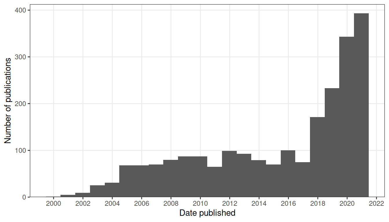
Figure 6.1: Number of publications in LCM transcriptomics PubMed search results over time. Bin width is 365 days.
LCM transcriptomics is also more geographically diffuse and spread out into many less well-known institutions and some developing countries, though some elite institutions are among the top contributors, such as Harvard Medical School and Massachusetts General Hospital (Boston), Columbia University, NYU, Rockefeller, and Sloan-Kettering (New York), NIH (Bethesda), and Cambridge University (Cambridge, UK) (Figure 6.2).
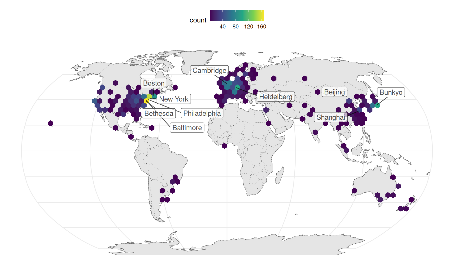
Figure 6.2: Geographic distribution of LCM transcriptomics research, with top 10 cities labeled. Number of publications is binned over longitude and latitude.
After identifying common and relevant phrases in the abstracts, the abstracts were tokenized into unigrams. We used the stm R package (M. E. Roberts, Stewart, and Tingley 2019) to identify topics. The cities in which the research was conducted, date published or posted on bioRxiv (linear, not transformed), and journal (including bioRxiv) were used as covariates for topic prevalence, because labs and journals may have preferred topics and city is a proxy to institution, and it’s reasonable to assume that prevalence of at least some topic changes through time, such as due to evolution of technology. Cities and journals with fewer than 5 papers were lumped into “Other”. From a trade off between held out likelihood and residual, and between topic exclusivity and semantic coherence, we chose 50 topics. Code used to find this can be found here.
Here stm stands for structural text mining. A generative model of word counts is fitted with the word counts in each abstract as well as abstract level covariates, here date, city, and journal. Among parameters of the model estimated are the proportion of each topic in each abstract after accounting for covariates (\(\theta\)), topic proportions in the corpus (\(\gamma\)), and probability of getting each word from each topic (\(\beta\)). See the stm vignette for more details. stm can not only detect topics without having a human read all the abstracts, but also find how covariates relate to topic prevalence.
6.1 Topic modeling
As already mentioned, microarray was first demonstrated on LCM samples in 1999, profiling 477 cDNAs from rat neurons (Luo et al. 1999). Since then, LCM transcriptomics has been used on many research topics, such as various aspects of cancer (topics 5, 6, 8, 10, 11, 13, 16, 20, 24, 27, 34, 44, 50), botany (topics 9, 15, 21, 40, 43, 45), developmental biology (topics 1, 3, 17, 18, 29, 35, 39), neuroscience (topics 7, 14, 19, 23, 25, 32, 33, 36, 47), immunology (topic 12, 22, 48), miRNA (topic 5), and technical issues related to LCM (topics 4, 28, 37, 41) (Figure 6.3).
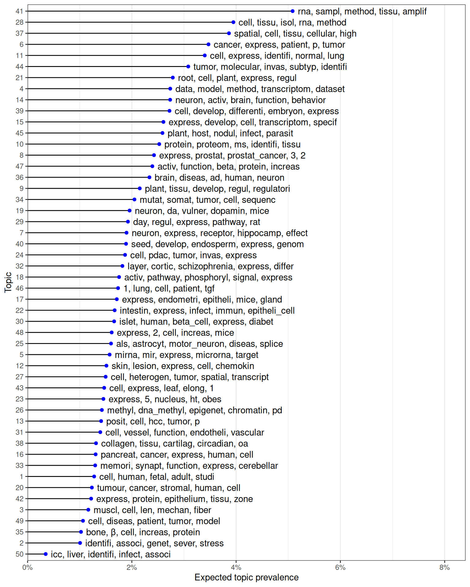
Figure 6.3: Top words for each of the 50 topics, ordered by expected topic prevalence and showing top 5 words contributing to each topic.
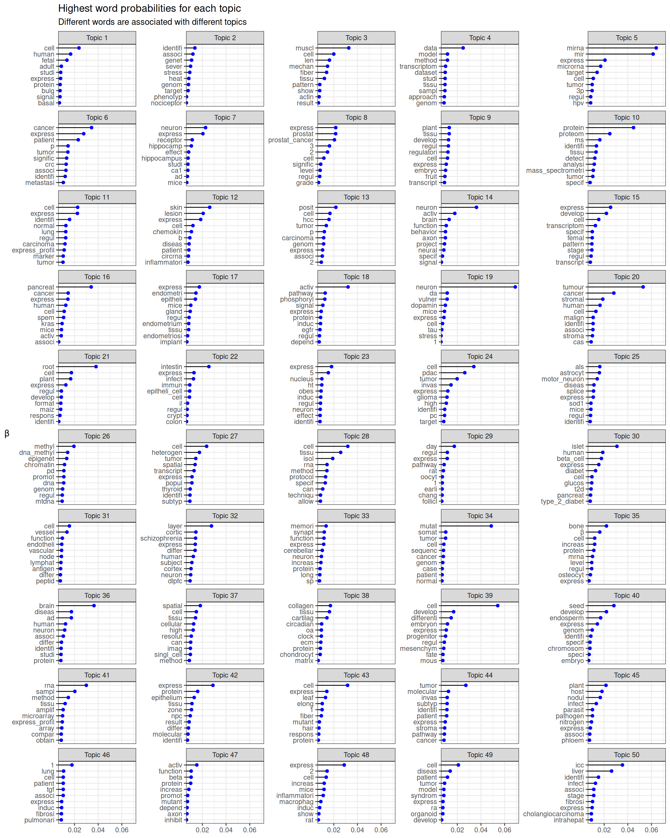
Figure 6.4: Probability of top 10 words in each topic. Open image in new tab to see the text.
While in most cases, the topic is apparent from the top words, some topics are less apparent (e.g. topic 49). From the top words and quick glances of abstracts with the highest proportion of each topic, the 50 topics are summarized here in more human readable terms:
- Stem cell and fetal development
- GWAS, genetic screens, and genetics of complex phenotypes
- Biomechanics, ECM, eye lens, muscles, and morphogenesis
- Data analysis, especially of RNA-seq, but also of 3D genome structure and microarray
- miRNAs in cancer
- Quantitative analyses of cancer, clinical and bioinformatic
- Hippocampus and Alzheimer’s disease, sometimes related to Down syndrome
- Prostate cancer and other stuff in molecular biology and biochemistry, probably because some prostate cancer papers have an emphasis on molecular biology
- Plant embryos, plant development, and some stuff about evolution and ecology related to plants
- Proteomics, especially in cancer
- Cancer progression and diagnostics, especially lung cancer
- Inflammation and immunology, especially in skin diseases
- Breast cancer and liver cancer, with an emphasis in data analysis
- Neural circuitry, neural plasticity, brain injury, and behavior
- Plant gamitogenesis and reproduction
- Spasmolytic polypeptide-expressing metaplasia (SPEM), oncogenes, KRAS
- Endometrium and implantation. Somehow the top 2 entries are about hearing loss. Why? Epithelium?
- Cell cycle, also hepatic zonation and circadian rhythm (the latter is also a cycle)
- Neurons, especially dopaminergic
- Tumor stroma and microenvironment
- Plant roots
- Intestine, especially microbiome and immune response
- Hypothalamus, obesity, and appetite
- PDAC, and some stuff about glioma and prostate cancer
- ALS, and other neurodegenerative diseases affecting motor neurons
- Epigenetics
- Tumor single cell profiling and cellular heterogeneity
- Tissue isolation and preparation
- Bone growth plate, especially recovery after radiotherapy, and some other stuff like oocytes, glaucoma, and epithelial injury
- Pancreas and diabetes, especially T2D
- Lymphocytes, lymphatic and blood vessels
- Prefrontal cortex and schizophrenia
- Synapses, dendritic spines, neuron potentiation, sometimes related to memory
- Cancer genomics, mutations, and phylogeny
- Bone formation, but also some other stuff about cancer and kidneys
- Neurodegenerative diseases, Alzheimer’s, Parkinson’s, and multiple system atrophy
- Spatial single cell techniques and imaging
- Connective tissues and ECM, and some other stuff about circadian rhythms
- Stem cells and development
- Plant seed development and reproduction
- RNA extraction and amplification, especially in microarray, but also in RNA-seq
- Lots of different stuff about epithelium
- Plant leaves, but also other stuff about gamitogenesis
- Cancer pathway analyses and molecular and cellular mechanisms
- Plant nitrogen fixation and soil microbiome
- Lots of different stuff related to fibrosis and fibroblasts, such as in lung diseases and graft rejection
- Neuron morphogenesis, axon guidance, somehow also angiogenesis, protein signaling
- Inflammation, immune response, especially in atherosclerosis, though there’s some other stuff about blood vessels
- Model organisms and in vitro model systems
- Intrahepatic cholangiocarcinoma (ICC)
Some of them might not really be related to LCM (e.g. GWAS), and some seem to be a mixture of different topics recognized by humans but seemingly united by something else in common. There are very likely more than 50 topics present, depending on how a topic is defined. The topics can be broadly categorized into Botany, Cancer, Development, Immunology, Neuroscience, Technical, and Other, though these categories can overlap. Some of the “Other” topics seem like mixtures of multiple topics, such as topic 29, while some are very specific and relevant, such as topic 30 (pancreas and diabetes). The broad categories will be used in further analyses.
Clusters of related topics can be seen in the topic correlation plot. See documentation of topicCorr in the stm package for more details. Here we use a high-dimensional undirected graphical (HUGE) model (T. Zhao et al. 2012) to estimate the topic correlation graph. The topic proportions (\(\theta\)) are assumed to be multivariate Gaussian, and HUGE tries to identify edges connecting topics that are not independent from each other conditioned on everything else, while trying to keep the graph sparse (few edges). While \(\theta\) is not Gaussian, the results from HUGE aren’t unreasonable.
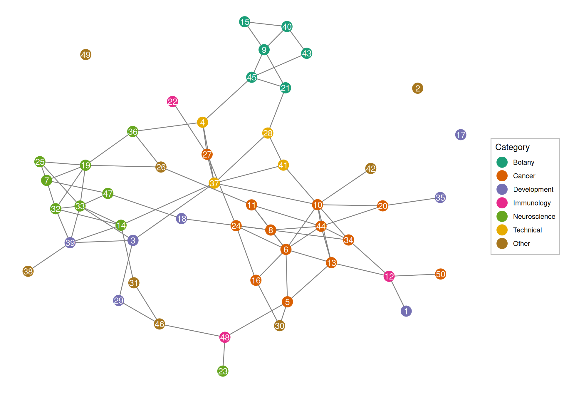
Figure 6.5: Correlation between topics.
Indeed, cancer, botany, neuroscience, and technical topics tend to cluster together, although this is not the case for immunology and development.
6.2 Changes of word usage through time
We binned dates into years and tested for association of word proportion in each year with the year by fitting a logistic regression model and checking significance of the coefficient for year; word frequency per year since 2001 for the significant words (after Benjamini-Hochberg multiple testing correction) are shown in Figure 6.6. Because too many words are significant, only top 10 from words with decreasing frequency and top 10 with increasing frequency are plotted.
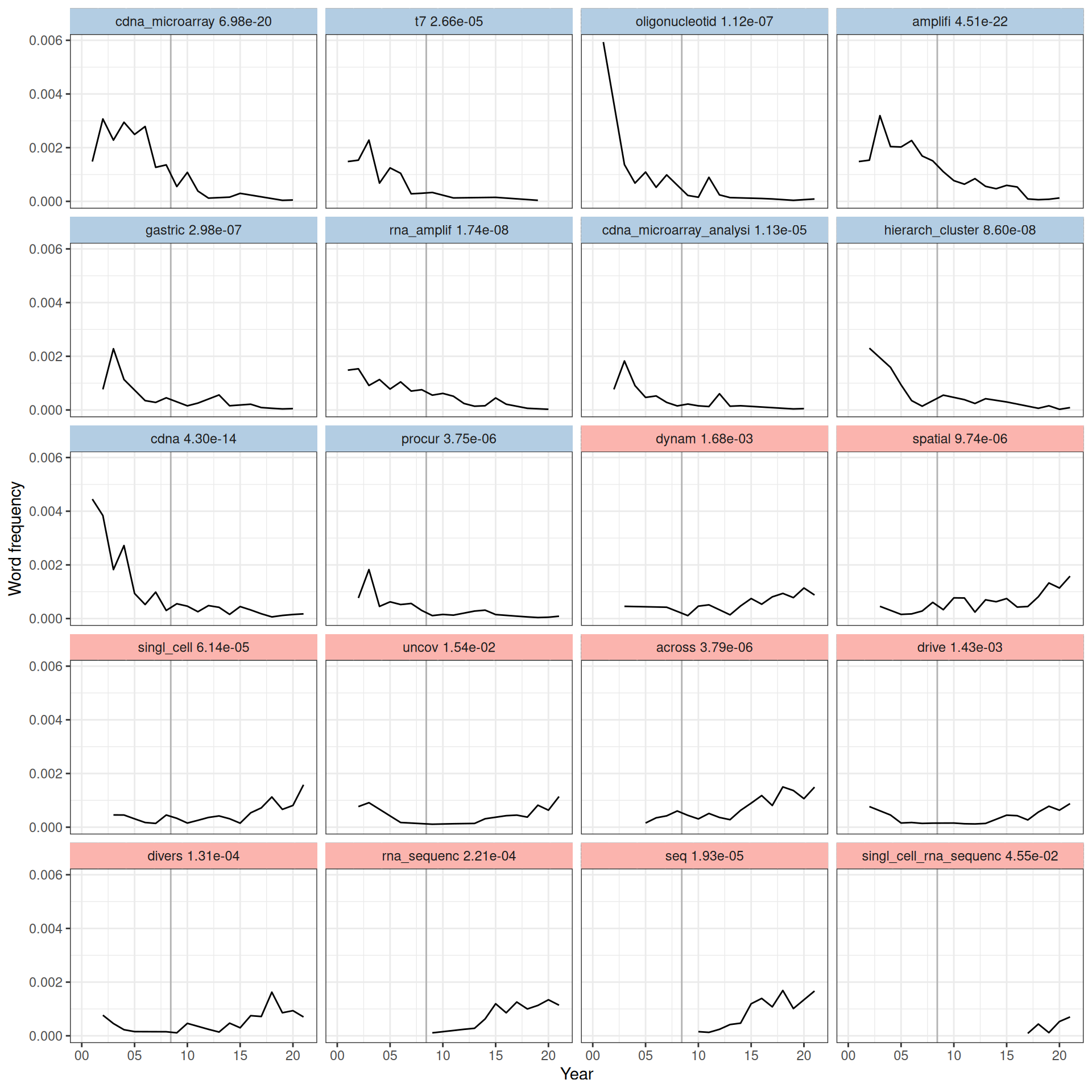
Figure 6.6: Word frequency over time since 2001 for words significantly associated with time, sorted from the most decreasing to the most increasing in frequency in time according to the slope in the model. The adjusted p-value of each word is shown. Vertical line marks June 6, 2008, when the first paper about RNA-seq was published (Nagalakshmi et al. 2008).
Here we see that words and phrases associated with microarray and RNA amplification have declined in frequency, while words associated with RNA-seq, single cell, as well as words discussing molecular mechanisms have increased in frequency (Figure 6.6). While transcripts from LCM samples from recent studies were still amplified, the relevant terms decreased in frequency probably because more recent studies, such as ones in the curated database, tend to cite established protocols and kits of library preparation that do the amplification such as Smart-seq2 rather than discussing amplification directly. The “spatial” is associated with current era techniques. Such trends can also be clustered and shown in a heatmap.
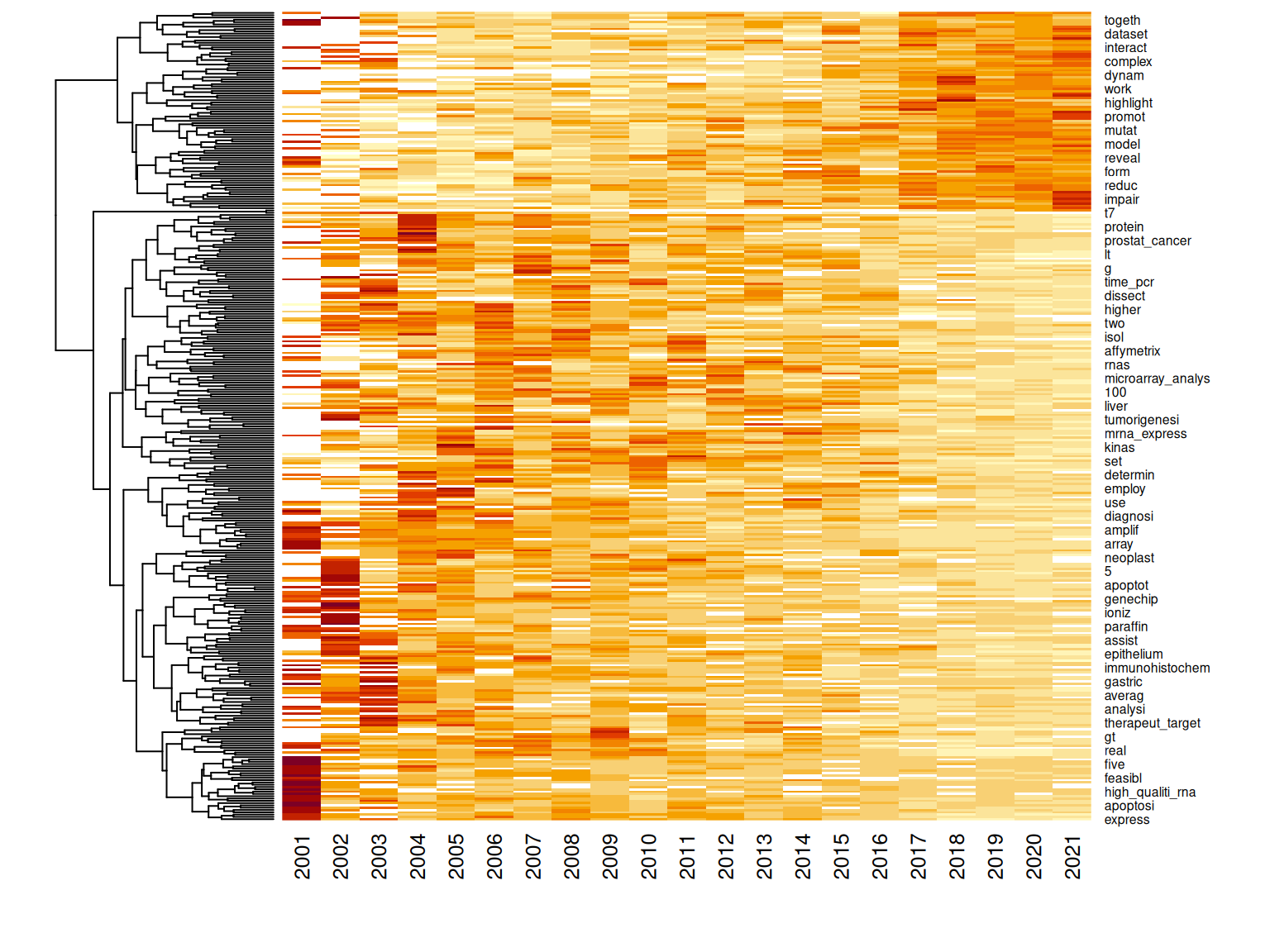
Figure 6.7: Heat map clustering changes in word frequency over time. The rows of the matrix are normalized, only showing trend rather than frequency.
Some words have increased in frequency, especially since 2015 (Figure 6.7). Some words sharply decreased in frequency in the early 2000s. However, some words have increased in frequency, peaking in the late 2000s and early 2010s, before declining. Among the terms whose frequency peaked around the early 2010s are “microarray” and “microarray analysis”, perhaps because while RNA-seq was introduced in 2008, microarray did not immediately become obsolete, or perhaps because microarray results are often compared to RNA-seq results, though perhaps wordings changed through the 2000s so the “cDNA” in “cDNA microarray” was omitted (Figure 6.6). Frequency of “real time PCR” also declined, probably because real time PCR was often performed along side microarray but not scRNA-seq to corroborate microarray results (e.g. (Cunnea et al. 2010; Kitamura et al. 2017)), so usage of this term declined with the decline of the cDNA microarray. Besides microarray related terms, some of the words that decreased in frequency are biological terms related to cancer. The “frequency” here is the proportion of all words from all abstracts of a year taken up by a word; the decline in proportion can either be due to decline in interest in the topics that use the word or growth in other topics that don’t use the word. This will be explored further in the next section.
6.3 Changes of topic prevalence through time
We tested for association of prevalence of each of the 50 topics with time using the estimateEffect function in the stm package. Samples of the parameters were taken from the variational posterior of the stm model to estimate the variances of the slopes of the linear model of topic prevalence vs. date published, as well as to test whether topic prevalence is significantly associated with time. The p-values of the slopes were corrected for multiple hypothesis testing with the Benjamini-Hochberg method. While the linear model only captures monotonous changes, a more flexible model, such as b-spline transform of the date, was not used because of the modest size of this corpus – on average, each topic has only 45 abstracts, though some topics are larger and some smaller.
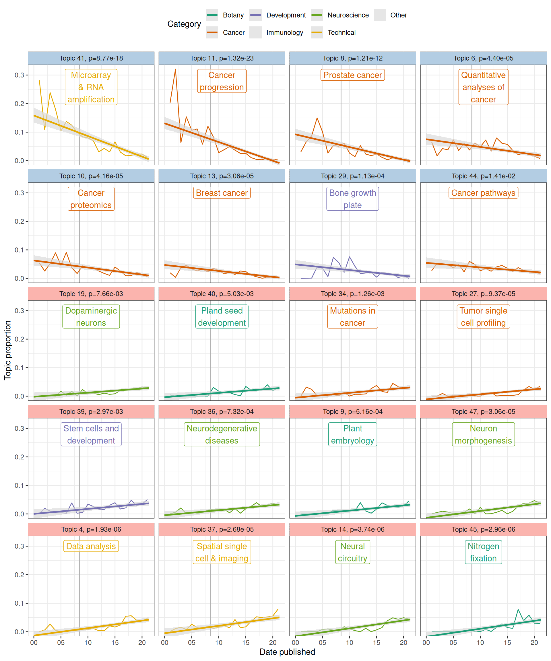
Figure 6.8: Topic prevalence over time since 2001 with fitted linear model. Gray ribbon indicates 95% confidence interval (CI) of the slope, estimated from the samples of the variational posterior of the stm model. Vertical line indicates advent of RNA-seq in 2008. Light blue facet strip means decreasing trend with adjusted p < 0.05, and pink strip means increasing.
As many topics have statistically significant associations with time, only the top 10 most decreasing and top 10 most decreasing topics are plotted here (that’s what I intended, but there were only 8 significantly decreasing topics, so top 12 increasing topics are shown). In the early 2000s, a major topic of research about LCM was reliability of T7-based PCR amplification of the small amount of transcripts from samples for microarray, but the prevalence of this topic (topic 41) has declined over time (Figure 6.6, Figure 6.8). The reason for such decline can be a combination of the following: First, other topics in neuroscience and botany emerged and grew (Figure 6.8); some of them are now among the most prevalent topics (Figure 6.3). Second, usage of terms related to microarray and RNA amplification for microarray declined while usage of terms related to RNA-seq increased after 2008 due to the advent of RNA-seq because the latter replaced microarray as the transcriptomics method of choice, so the decline is expected (Figure 6.6). Also as expected, prevalence of topics in data analysis (topic 4) and spatial single cell and imaging technologies (topic 37) increased. Interestingly, cancer topics are among the most significantly decreasing (Figure 6.7, Figure 6.8). Because unlike cDNA microarray, these topics are still relevant today, such decline is puzzling.
Next, we checked whether whether the rise of topics not directly related to cancer may be relevant to the decline of proportions of cancer topics. In stm, the abstracts are not hard assigned to topics. Rather, each abstract has a proportion of each topic, and abstracts often have over 90% of one topic. Here, for simplicity, we say an abstract “has” a topic if the proportion of the topic in the abstract is at least 25%.
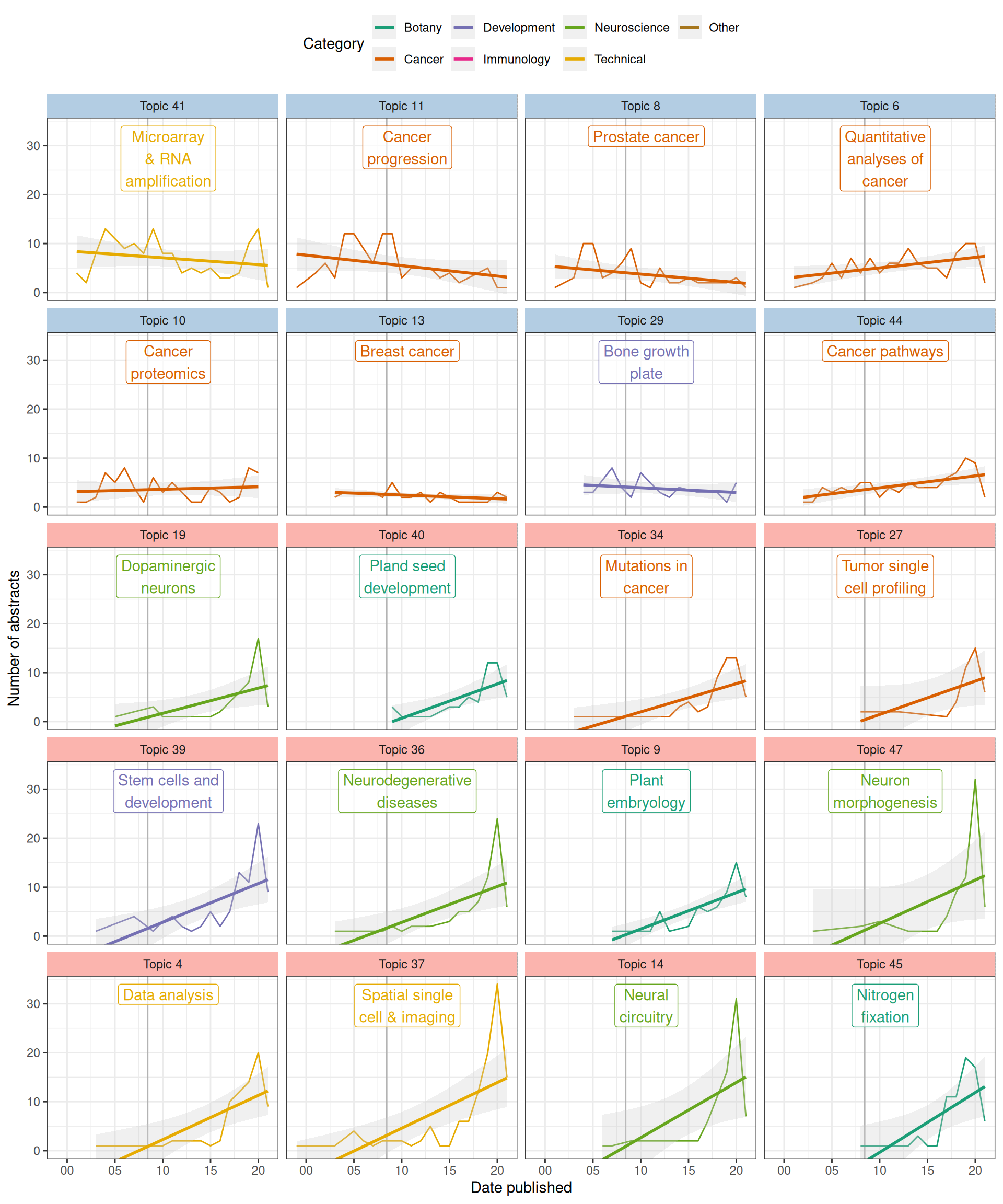
Figure 6.9: (ref:topic-count-cap)
When the number of abstracts with each topic is plotted, the declines are less drastic or reversed while the increases became much more drastic, especially after 2015, perhaps due to the rise of scRNA-seq, whose library preparation methods made it possible to quantify transcripts from small amount of tissues from LCM (Figure 6.9). These trends don’t necessarily correspond to the overall trend across the corpus (Figure 6.1). Then we see in recent years a diversification of topics that may be related to LCM from search results, resulting into decrease of proportion of some older topics the interest in which might not have drastically decreased if not somewhat increased, though not increasing as quickly as other topics. Nevertheless, it is clear that some cancer topics have decreased even in counts. However, remember that some of the stm topics seem to be mixtures of multiple topics recognizable by humans and these stm topics might have picked up aspects of the abstracts less readily noticed by humans. In other words, it might not be that interest in some cancers decreased per se, but thanks to scRNA-seq, the way these cancers are discussed changed, using words that contributed to other, growing topics. Furthermore, because so many different topics are drastically growing in recent years, the increase in proportion of each of them became less drastic.
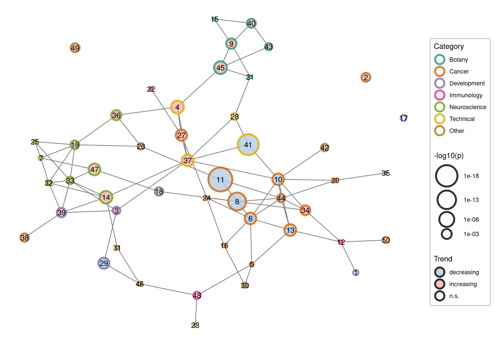
Figure 6.10: Correlation between topics colored by both broad categories of the topics and whether its proportion increased, decreased, or did not significantly change (n.s.).
Now return to the topic correlation graph, and all the 50 topics, along with their trends, are shown (Figure 6.10). Overall, cancer topics tend to be decreasing in proportion. As already seen in Figure 6.9, this is in part due to growth in non-cancer topics but in part due to decline in some cancer topics. Botany and neuroscience topics tend to increase in proportion. This trend is also evident in the topic correlations. Microarray and RNA amplification (topic 41) is correlated with a cancer topic, while spatial single cell and imaging (topic 37) and data analysis (topic 4) are correlated with neuroscience topics. Topic 27, which is about single cell profiling of tumors, has grown, perhaps due to the growth of scRNA-seq. Possibly, as cancer is still relevant, the decline in some cancer topics fed into topic 27 as tumors are examined at the single cell level.
6.4 Association of topics with city
Again, with the estimateEffects function, we identify cities associated with certain topics. Some topics might be more spread out, while some some may be confined to a few institutions, which are approximated by city here because it’s more difficult to automatically extract institutions from the author address on PubMed than cities. Some institutions might specialize in certain topics. Also note that while for PubMed papers, the cities of the first author are used, because the first author has greater contribution to the paper, only the address of the corresponding author is available from the bioRxiv API. Furthermore, multiple institutions across continents may collaborate on one paper, so the cities here only give a rough idea where LCM related research takes place. Here only the names of the cities are used, with the state and country they are in to distinguish between cities with the same name, without the longitude and latitude, because we don’t expect an association between topic and the coordinates in and of themselves, nor do we expect spatial autocorrelation of the topics.
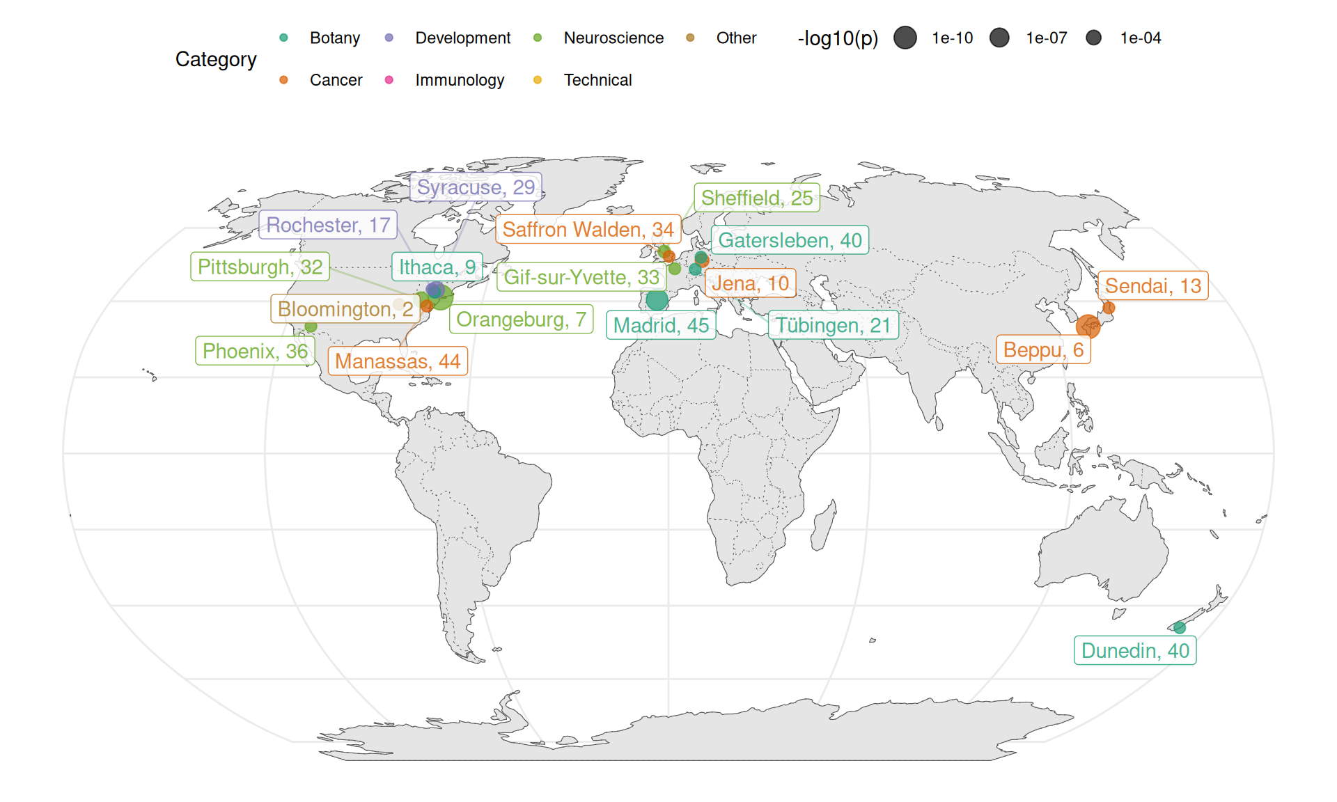
Figure 6.11: Cities associated with topics (p < 0.005) shown on a map.
Here we note that Center for Dementia Research, Nathan Kline Institute in Orangeburg has greatly contributed to research in hippocampal CA1 pyramidal neurons in Alzheimer’s disease and Down syndrome (topic 7) (Figure 6.11). This is the first time I heard of Nathan Kline. Department of Plant Biology at Cornell, Ithaca has greatly contributed to study of plant development (topic 9). Topic 17 is a mixture of topics recognizable by humans; besides the endometrium, some of the top entries are about hearing loss, which come from University of Rochester. George Mason University in Manassas, Virginia contributed several papers about cancer pathway analysis (topic 44). University of Pittsburgh has disproportionate contribution to the study of prefrontal cortex and schizophrenia (topic 32), dating back to 2007. Centro de Biotecnologia y Genomica de Plantas (UPM-INIA), Madrid has disproportionate contribution to the study of soil microbiome and nitrogen fixation (topic 45). University of Sheffield has a long history and disproportionate contribution to the study of neurodegenerative diseases affecting motor neurons (topic 25), dating back to 2007.
Association of a topic with an institution that used to greatly contribute to the topic but then stopped might also explain why some topics declined in prevalence over time although drastic growth in other topics might be a better explanation (Figure 6.8, 6.9). Topic 29 prominently features the bone growth plate though this stm topic has entries for other biological systems as well. These bone growth plate papers come from Upstate Medical University in Syracuse, New York, from 2005 to 2010. Decline in topic 29 might be related to cessation of study of the growth plate at this institution after 2010, though other institutions have not picked up this topic afterwards. Institute of Human Genetics and Anthropology, Friedrich-Schiller-University in Jena, Germany greatly contributed to cancer proteomics (topic 10) between 2004 and 2011 but then stopped, though other institutions carried on studying this topic. Kyushu University Beppu Hospital in Japan greatly contributed to quantitative analyses in cancer (topic 6) from 2005 to 2014, although other institutions continue contributing to this topic, whose paper count actually increased over time although the topic’s proportion decreased due to drastic growth in other topics (6.9). The vast majority of LCM related publications from Sendai, Japan are about breast cancer (topic 13), from between 2007 to 2017, which is why Sendai is associated with this city although this topic is widespread.
Association of a city with a topic can also be visualized with topic proportion in each city from estimateEffect (Figure 6.12). Here topic 45 (soil microbiome and nitrogen fixation) is plotted, but readers on RStudio Cloud can try other topics.
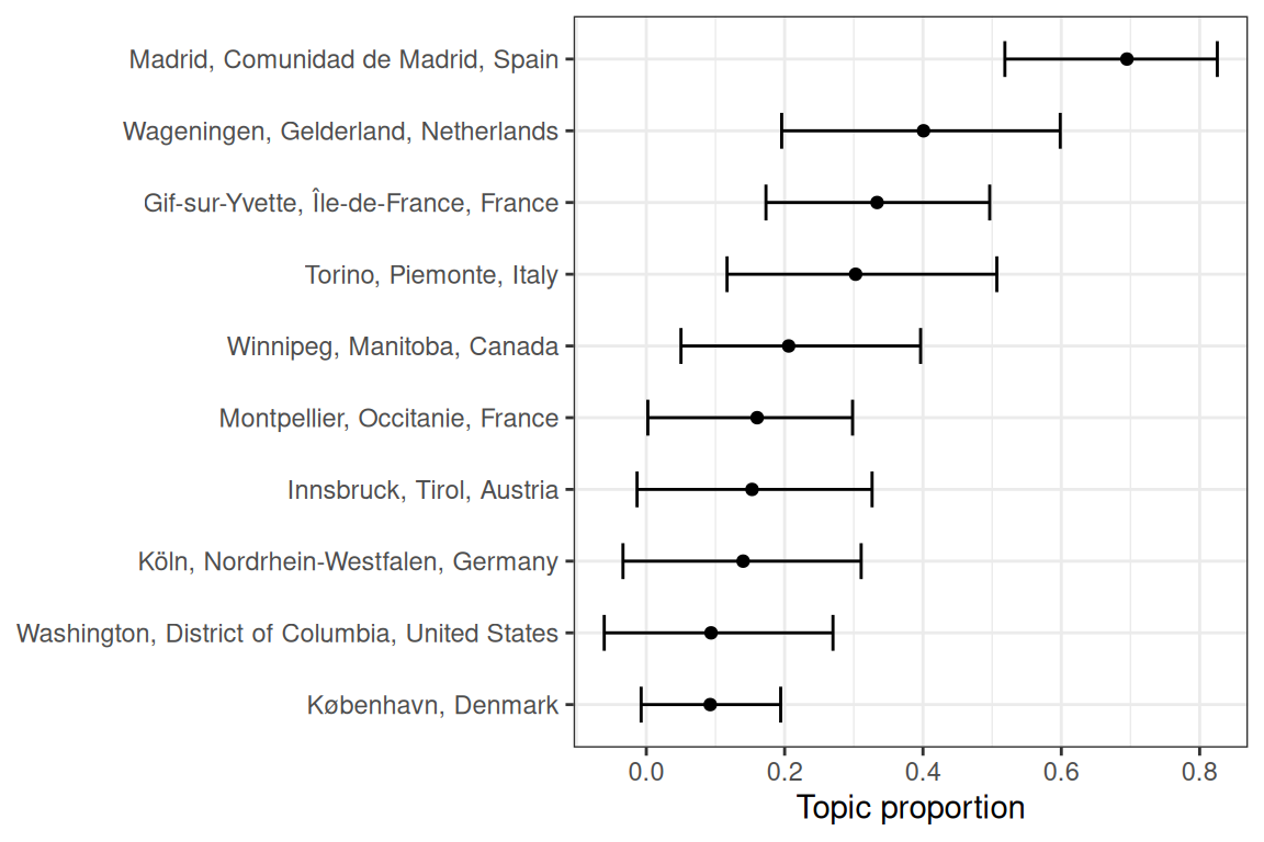
Figure 6.12: Proportion of topic 45 in each city. Error bars are 95% CI of the point estimate.
Here “disproportionate” means disproportionate within this corpus of LCM related search results. Institutions with “disproportionate” contribution to a topic do not necessarily dominate such topic although the topic may dominate the institution, i.e. the topic takes up a very large proportion of abstracts from this institution within this corpus. Nor are these institutions necessarily elite; this analysis might be an interesting way to discover labs from not so well-known institutions that may be outstanding in some topics. The institutions are often not elite because elite institutions often greatly contribute to many topics, weakening the association of the institution to the topic. Except for growth plate in Syracuse, we have not identified topics largely confined to an institution.
6.5 GloVe word embedding
We used global vector (GloVe) embedding to identify linear substructures in the word vector space of the LCM transcriptomics abstract corpus and to identify contexts (Pennington, Socher, and Manning, n.d.). In GloVe embedding, words are represented by vectors. Words with similar meanings tend to be closer together in this vector space, and differences between word vectors can encode meaning as well. The “meanings” come from the context, or word co-occurrence. GloVe was devised to find a word embedding with properties like “king” - “man” + “woman” = “queen” or “ice” - “solid” + “gas” = “steam”, and related words like “cancer” and “tumor” are close together but both are far from unrelated words like “flower”.
This corpus was used to train a 125 dimensional embedding, and the embeddings of words occurring more than 30 times in the corpus were projected to lower dimensions with principal component analysis (PCA) to find axes explaining the most variance in the embedding, hopefully identifying dominant axes of meaning within this corpus. The words are also Louvain clustered in the embedding space to find clusters of words related in meaning.
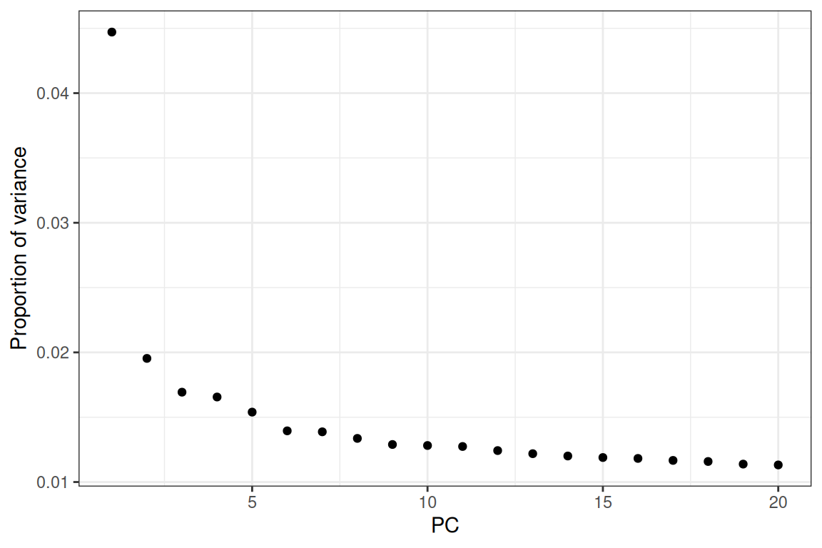
Figure 6.13: Proportion of variance explained by each of the first 20 principal components (PC).
The first principal component (PC) explains over 5% of the variance, and then the “elbow” is at PC5.
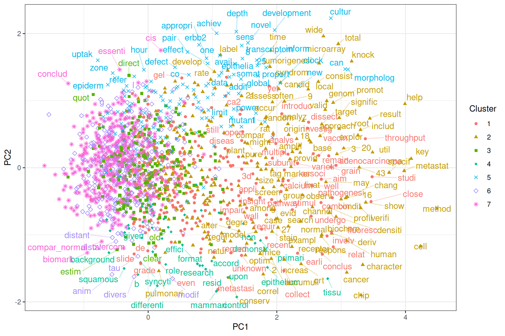
Figure 6.14: Projection of word embeddings into the first 2 PCs. Each point is a word occuring over 30 times in the corpus. Not all words are labeled to avoid overlaps in the labels. Words and points are colored by Louvain clusters.
Words more positive in PC1 are often gene names, parts of gene names, or acronyms, and names of specific biological entities or processes. In contrast, words more negative in PC1 tend to be more general and more widely used. PC2 separates the technical from the biological (Figure 6.14). As expected, “cancer”, “tumor”, and “disease” are not far from each other (bottom left), and “malignant” and “invasive” are close (bottom center). PC1 explains more variance than all other PCs; though it’s only 5.5%, it picked up a very important dimension in word meanings in this corpus. PCs are arranged in decreasing order of variance explained.
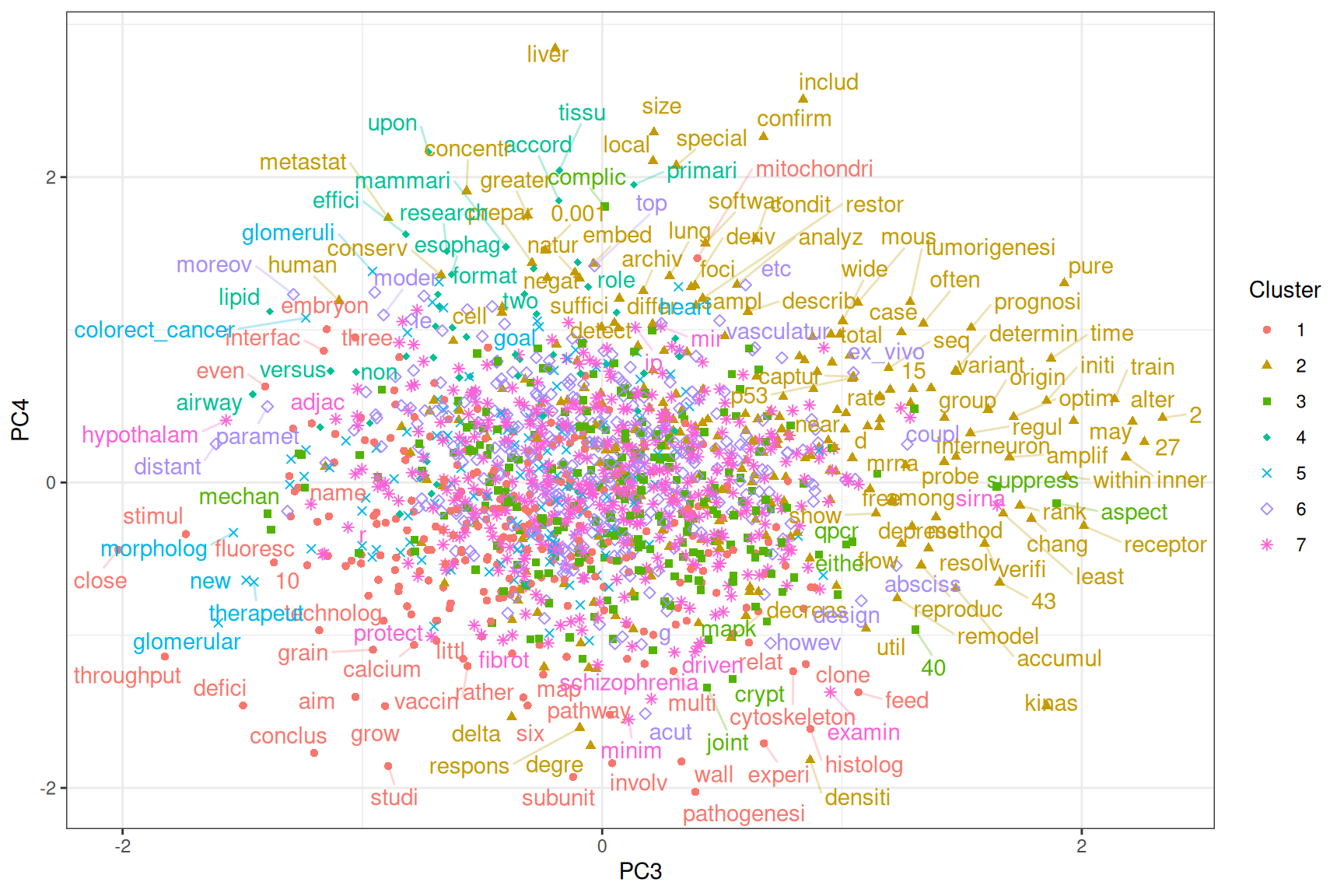
Figure 6.15: Projection of word embeddings into the 3rd and 4th PCs.
PC3 separates processes and interactions from entities of samples, tissues, organs, and diseases. PC4 separates the molecular and cellular and the quantitative from the qualitative. Some of the qualitative terms are used to discuss implications of results of the papers (Figure 6.15).