3 Data analysis in the prequel era
From the earliest days of enhancer and gene traps to the (WM)ISH atlases, identifying genes with spatially and temporally variable expression patterns, comparing and classifying the patterns, identifying new marker genes of cell types and developmental stages, and using gene expression to redefine cell types have been among the goals of the studies (O’Kane and Gehring 1987; Gossler et al. 1989; Wurst et al. 1995; Sundaresan et al. 1995; Gawantka et al. 1998; Tomancak et al. 2002; E. S. Lein et al. 2007). In the prequel era, these were typically done manually, which, with the growing size of atlases in the 2000s, was time consuming and potentially inconsistent between curators. Thus, computational methods were developed to analyze images from the (WM)ISH atlases. This chapter reviews data analysis methods designed for (WM)ISH atlases and does not involve scRNA-seq data; methods involving both (WM)ISH and scRNA-seq are reviewed in Chapter 7 for the current era because scRNA-seq is at present a popular and rapidly growing field, too in vogue to be considered “prequel”. If our collection is representative, then the rise of prequel data analysis methods arrived much later than that of data collection (Figure 3.1).
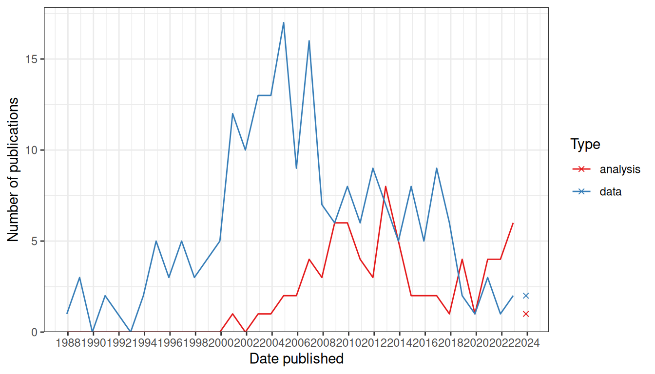
Figure 3.1: Comparing trends in data collection and data analysis in the prequel era. Bin width is 365 days. The x-shaped points show the number of publications from the last bin, which is not yet full.
Except for one study on Platynereis dumereilii in 2014 (Pettit et al. 2014), on Xenopus tropicalis in 2018 (Patrushev et al. 2018), one on post mortem human brain in 2021 (Abed-Esfahani et al. 2021), all data analysis methods in our collection were designed for either Drosophila melanogaster or Mus musculus (Figure 3.2). There seem to have been two waves; the first for Drosophila, peaking in the late 2000s, mostly concerning the BDGP in situ atlas, and the second for mice, peaking in early 2010s, mostly concerning ABA (Figure 3.2). The apparent rise since 2019 is in part driven by deep learning methods to annotate gene expression patterns or infer gene interactions. Given the small number of publications in this category and potential incompleteness of the curation, the trends should be taken with a grain of salt.
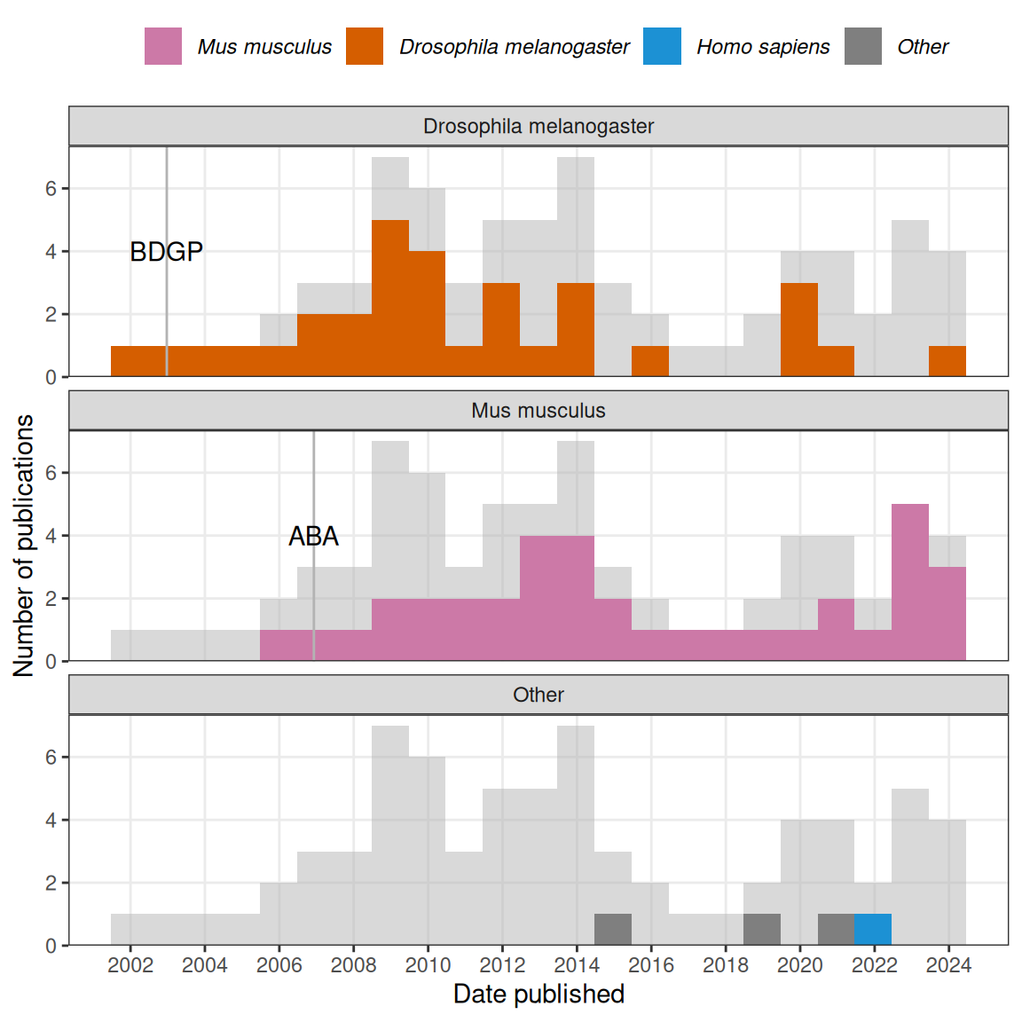
Figure 3.2: Gray histogram in the background is overall histogram of prequel data analysis literature. Number of publications in each time bin for each species is highlighted in the facets.
3.1 Gene patterns
The most common goal of these data analysis methods was to annotate and compare gene expression patterns, especially to automate annotation of the BDGP atlas (Figure 3.3). It seems reasonable to focus on 4 phases in this category: first, in early to mid 2000s, after image registration, the images were binarized into “expressed” and “not expressed” regions, and the shapes of the expressed regions were summarized and compared. Metrics to summarize the shapes included moment invariant (Jayaraman, Panchanathan, and Kumar 2001; Gurunathan et al. 2004), Hamming distance (Kumar et al. 2002), and a weighted score involving L1 distance between column or row histograms of two images (Zheng Liu et al. 2007). These unsupervised methods enabled clustering of patterns and querying genes with similar patterns to a given gene.
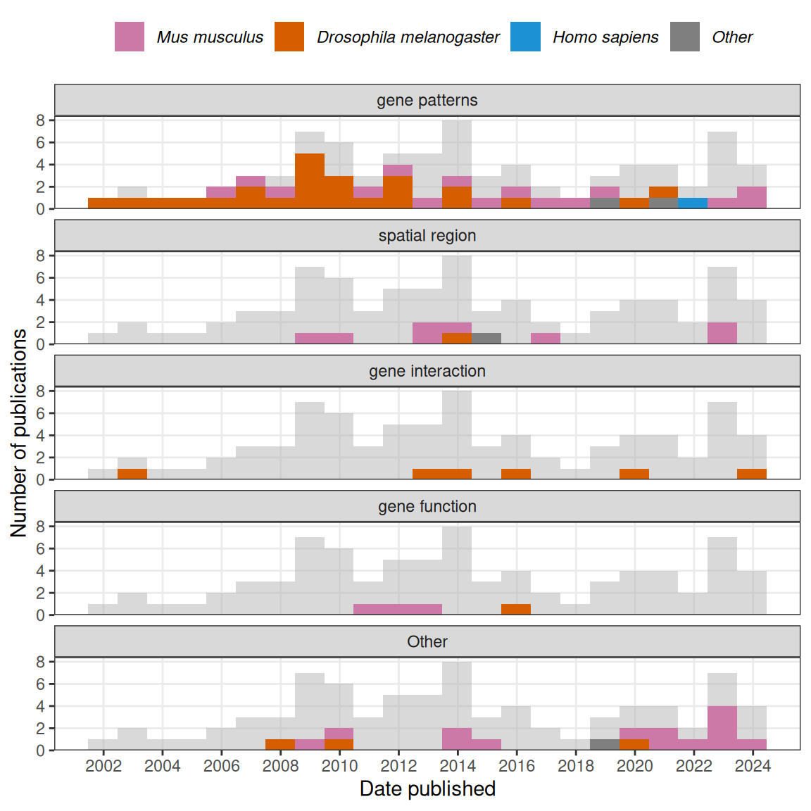
Figure 3.3: Number of publications in each time bin for each category of data analysis is highlighted in the facets.
Second, from the mid 2000s to mid 2010s, many supervised and unsupervised methods for gene expression pattern annotation or comparison were developed. In supervised methods, extensive feature engineering more sophisticated than binarization was performed on registered images for image annotation with machine learning classification. These methods were trained with existing BDGP annotations and developed to automatically annotate the BDGP expression patterns with controlled vocabulary (CV) of anatomical regions where genes were expressed. In BDGP, a gene gets annotated with a CV if the gene was deemed expressed in the anatomical region and developmental stage denoted by the CV, so the annotation typically contained a list of CVs.
The feature engineering can be based on the wavelet transform (J. Zhou and Peng 2007) and Fourier coefficients (Heffel et al. 2008), but a particularly popular feature engineering method was scale-invariant feature transform (SIFT) (Lowe 2004; S. Ji et al. 2008; Y.-X. Li et al. 2009; S. Ji, Li, et al. 2009). A method published in 2009 that used SIFT followed by bag of words where “word” is a k means cluster (code book) was quite influential (S. Ji, Li, et al. 2009); several later methods were inspired by this method, with improved code books (Q. Sun et al. 2013; S. Ji, Yuan, et al. 2009; L. Yuan et al. 2012; Liscovitch, Shalit, and Chechik 2013). The most common classifier that take in the features to predict annotations is support vector machine (SVM) (Q. Sun et al. 2013; L. Yuan et al. 2012) or multi-label variants of it (S. Ji et al. 2008; S. Ji, Li, et al. 2009).
Unsupervised methods rely on clustering algorithms after images are registered on a common mesh, such as affinity propagation clustering (Frise, Hammonds, and Celniker 2010) and co-clustering (rows and columns of matrix are clustered simultaneously) (Jagalur et al. 2007; W. Zhang et al. 2013).
Third, another notable type of the feature engineering is dimension reduction. In 2006, some methods applied dimension reduction methods such as principal component analysis (PCA) and independent component analysis (ICA) to the registered images to find “eigen” patterns (Pan et al. 2006; H. Peng et al. 2006). Instead of PCA or ICA, the dimension reduction can also be sparse Bayesian factor analysis (Pruteanu-Malinici, Mace, and Ohler 2011), sparse dictionary learning (Yujie Li et al. 2017), and non-negative matrix factorization (NMF) (Noto, Barnagian, and Castro 2017; S. Wu et al. 2016). The dimension reduction can be used for unsupervised clustering of genes (Pan et al. 2006; H. Peng et al. 2006; Pruteanu-Malinici, Mace, and Ohler 2011), as well as supervised classification methods such as SVM and logistic regression to annotate gene expression patterns with controlled vocabulary (Pruteanu-Malinici, Mace, and Ohler 2011; S. Wu et al. 2016). Notably, in NMF, both the matrix for basis patterns and the coefficient matrix for the genes tend to exhibit block structures; the blocks in the gene coefficient matrix has been used to cluster genes (Noto, Barnagian, and Castro 2017).
Fourth, since 2015, convolutional neural networks (CNNs) have been adopted to analyze gene expression patterns. Typically, a pre-trained model, such as ResNet50, OverFeat, or Alexnet is used. With some modifications or retraining of the original model, the model can be used to extract features for gene pattern annotation with logistic regression (Zeng et al. 2015), classifying new patterns Long et al. (2021), and predicting interactions between genes (Yang Yang, Fang, and Shen 2019).
3.2 Spatial regions
Closely related to classifying gene expression patterns are these questions: What are the implications of gene expression patterns to traditional anatomical regions as in the CV? Can we discover novel anatomical regions from gene expression? How well do expression-based regions correspond to the traditional regions? A few studies, which we call “spatial region”, tried to answer these questions in the ABA (Figure 3.3). Clusters of expression patterns of cell type specific genes (Y. Ko et al. 2013), or the most localized genes (Grange et al. 2014), principal components of the patterns (Bohland et al. 2010), or patterns of coexpression modules were compared to traditional anatomy (Grange et al. 2014). At least in the mouse brain, with the principal components, these clusters may correspond to traditional anatomy quite well (Bohland et al. 2010). However, when cell types are taken into account in clustering, gene expression seems to be able to refine traditional anatomy (Y. Ko et al. 2013; Grange et al. 2014).
A clustering strategy for identifying spatial regions that takes the spatial neighborhood into account is Markov random field (MRF). In MRFs, nearby voxels can be made to be more likely to share a label, which can be cell type or histological region, and the probability of a voxel taking each of the labels only depends on labels of neighboring voxels. MRFs were used to delineate spatial regions in a 3D FISH atlas of the developing Platynereis dumereilii brain (Pettit et al. 2014), with 86 high quality genes. The images in the atlas were aligned into a 3D model and broken into voxels 3 \(\mu\)m per side, which is smaller than a typical single cell; the spatial neighborhood graph is the 3D square grid of the voxels. As FISH is not very quantitative, the gene expression was manually binarized. Expression of each gene at each voxel is modeled with a Bernoulli distribution, and the 86 genes are assumed to be independent. Cluster label assignment is modeled with Potts model, a type of MRF in which only neighboring voxels with the same label contribute to the probability distribution of the labels, thus favoring neighbors with the same label. The parameters, such as interaction strength between neighboring voxels for the Potts model and the probability parameter of the Bernoulli distributions are estimated with expectation maximization (EM).
3.3 Gene interactions
While not single cell resolution, (WM)ISH atlases provide transcriptomes within the tissue at a resolution far higher than that of typical bulk RNA-seq and bulk microarray, thus opening the way to studying coexperssion and interaction between genes within the tissue. There are a few methods that aim to decide whether two genes interact according to (WM)ISH images, some dating published long before the popularization of scRNA-seq. Already in 2002, an early method that compares binarized gene expression patterns was used to identify interactions among genes by comparing patterns from wild type and mutant backgrounds (Kumar et al. 2002).
However, as mutant lines are harder to obtain than wild type images, the simplest method is to set a threshold in Pearson correlation coefficient between two genes to decide an edge should be drawn on the gene coexpression graph (S. Wu et al. 2016; Campiteli et al. 2013).
Alternatively, a sparse Markov network whose nodes are genes and edges are presence of interaction can be learnt from expression profiles in each voxel (Puniyani and Xing 2013), or a CNN can be trained on known interactions and predict new interactions based on gene expression patterns (Yang Yang, Fang, and Shen 2019). There are other types of analyses, such as inferring gene function from expression pattern, identifying spatially variable genes, and gene expression imputation at locations. The latter two are still important topics in current era data analysis.
3.4 Decline
What contributed to the decline of the golden age of prequel data analysis? Partly a lack of usage of the methods developed, which was exacerbated by the decline of the golden age of (WM)ISH atlases in the 2010s so there were fewer new atlases where the methods can be applied (Figure 2.3). While many methods to automate gene expression pattern annotation for BDGP were developed before 2013, for the 2013 BDGP update that added images of 708 transcription factors, the BDGP annotated the new images with human curators instead of the automated methods (Hammonds et al. 2013). Nor did BDGP use the new methods to compare and classify the new gene expression patterns; instead, the curator assigned CV annotations were used for analysis (Hammonds et al. 2013; Tomancak et al. 2007). BDGP did not have a major update after 2013; as existing images have already been annotated, there is no need to automate annotations.
There are additional possible reasons why these methods were not used: First, it is unclear from the publications of the methods where the software implementation can be obtained. Second, a reason why most prequel analysis methods were developed for either BDGP or ABA is that since one gene is stained for in one embryo/section at a time, the images must be registered and standardized for different genes to be comparable; BDGP, through FlyExpress (Kumar et al. 2017), and ABA, provide images that have already been registered and standardized, while many other atlases, such as GEISHA, do not. Due to challenges in image registration in other organisms, the automated gene expression pattern analysis methods can’t be applied. Third, lack of usage of these methods can also be due to insufficient accuracy; from 2009 to 2013, the area under the curve (AUC) of the automated annotations is typically around 0.8 and rarely exceeded 0.9 (S. Ji, Li, et al. 2009; Pruteanu-Malinici, Mace, and Ohler 2011; L. Yuan et al. 2012; Q. Sun et al. 2013), which means when using such tools to annotate new images, extensive human review would still be required.
3.5 Geography of prequel data analysis
If our collection is representative, then contribution to prequel data analysis concentrates in a few institutions (Figure 3.4), not all of which are elite.
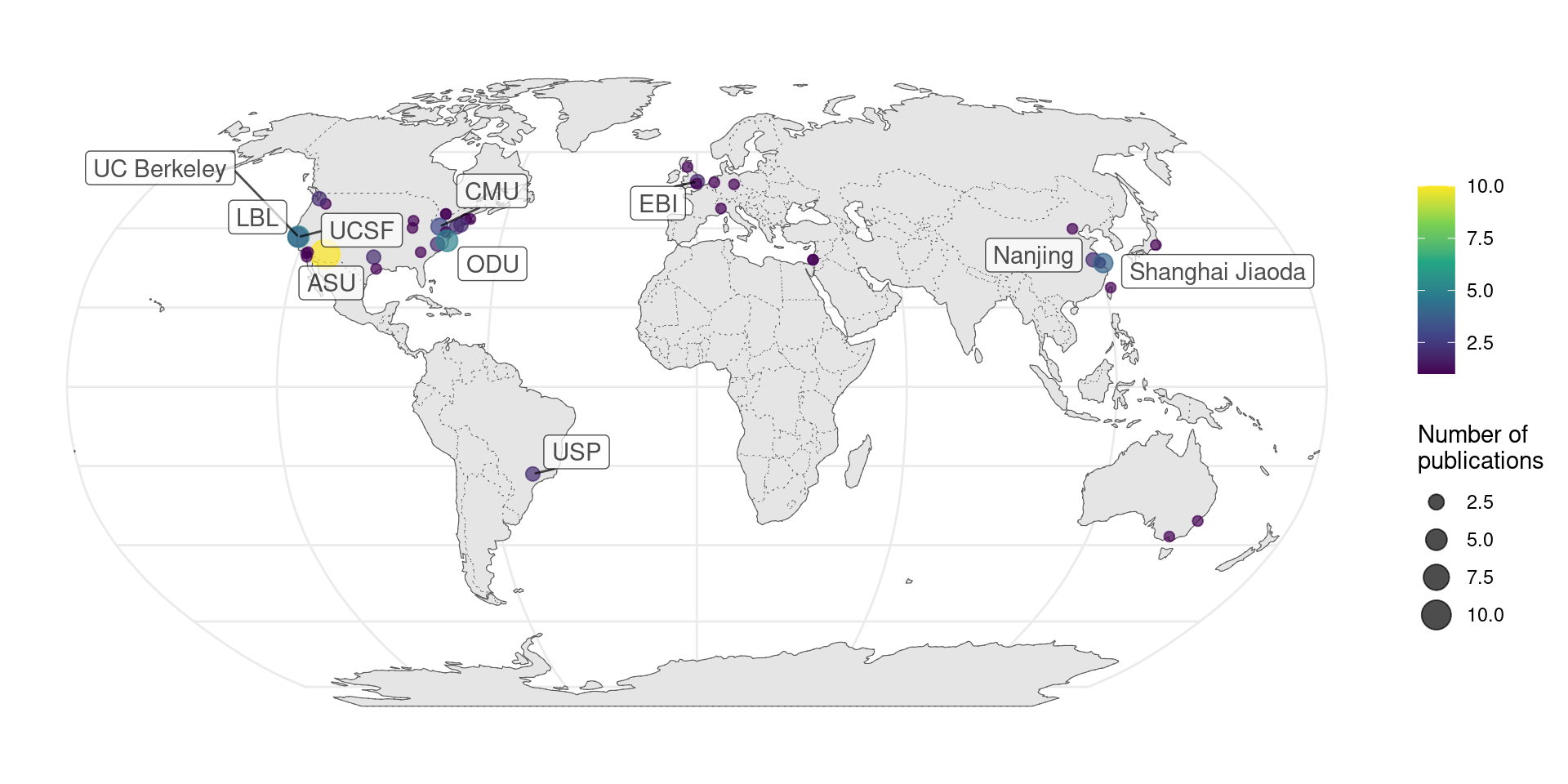
Figure 3.4: Number of publications per city for prequel data analysis.
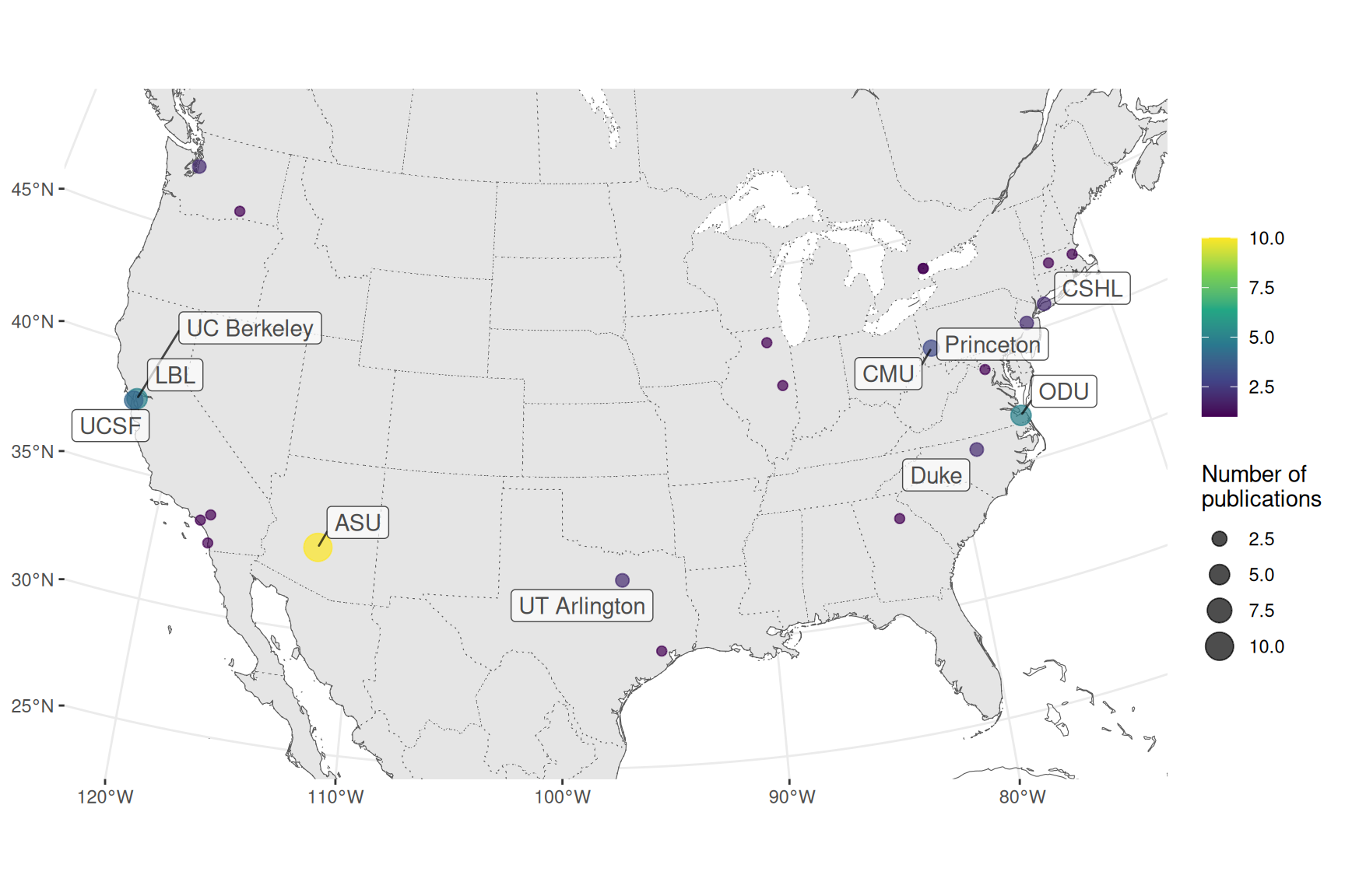
Figure 3.5: Number of publications per city for prequel data analysis in the US.
When broken down by species, it seems that distinct institutions contributed to data analysis of Drosophila and mouse data. UC Berkeley and Lawrence Berkeley National Laboratory (LBL) are responsible for BDGP, and Allen is responsible for ABA. However, among the top contributors are other institutions such as Arizona State University (ASU) and Old Dominion University (ODU) (Figure 3.6).
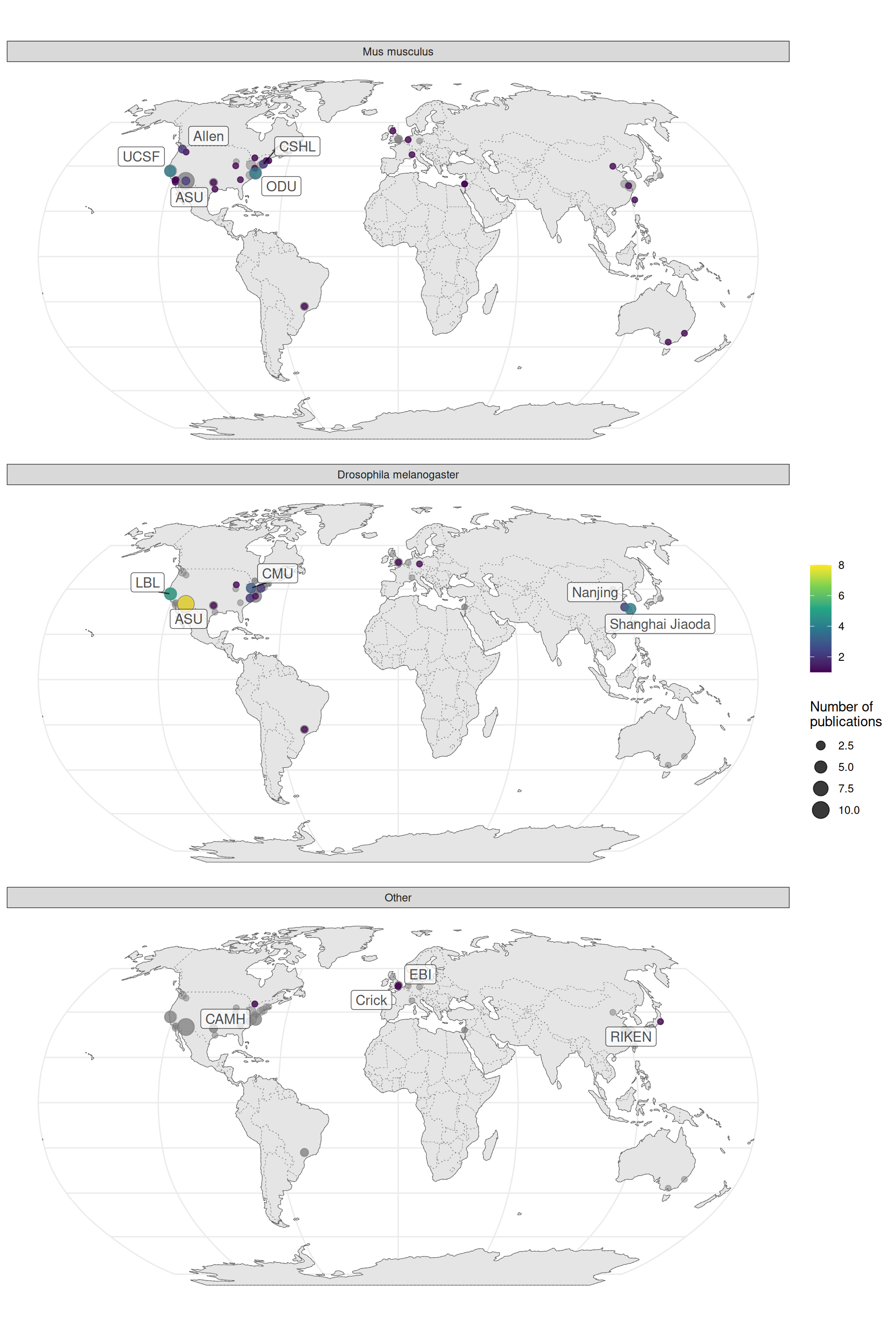
Figure 3.6: Number of publications per city for prequel data analysis broken down by species of interest.